GoodData Demo Workspace
If you are on the Free or Growth GoodData plan, we suggest you start with the Demo Workspace. The Demo Workspace is preloaded with the following items to help you learn how to use the GoodData platform:
Example data
Example metrics
Pre-built insights and dashboards
Logical Data Model
The data and datasets are organized in a Logical Data Model (LDM) in the Demo Workspace, you cannot edit the model.
Most of the content in Getting Started is designed with the assumption you are using the Demo Workspace data. However, all the content is applicable to your own workspace should you decide to ignore the demo workspace.
Demo Dashboards
Dashboards is the first screen you see when you open the Demo Workspace. The dashboards screen is where you construct dashboards with the insights you create in the Analytical Designer. There are Dashboards created with pre-built insights included in the demo workspace.

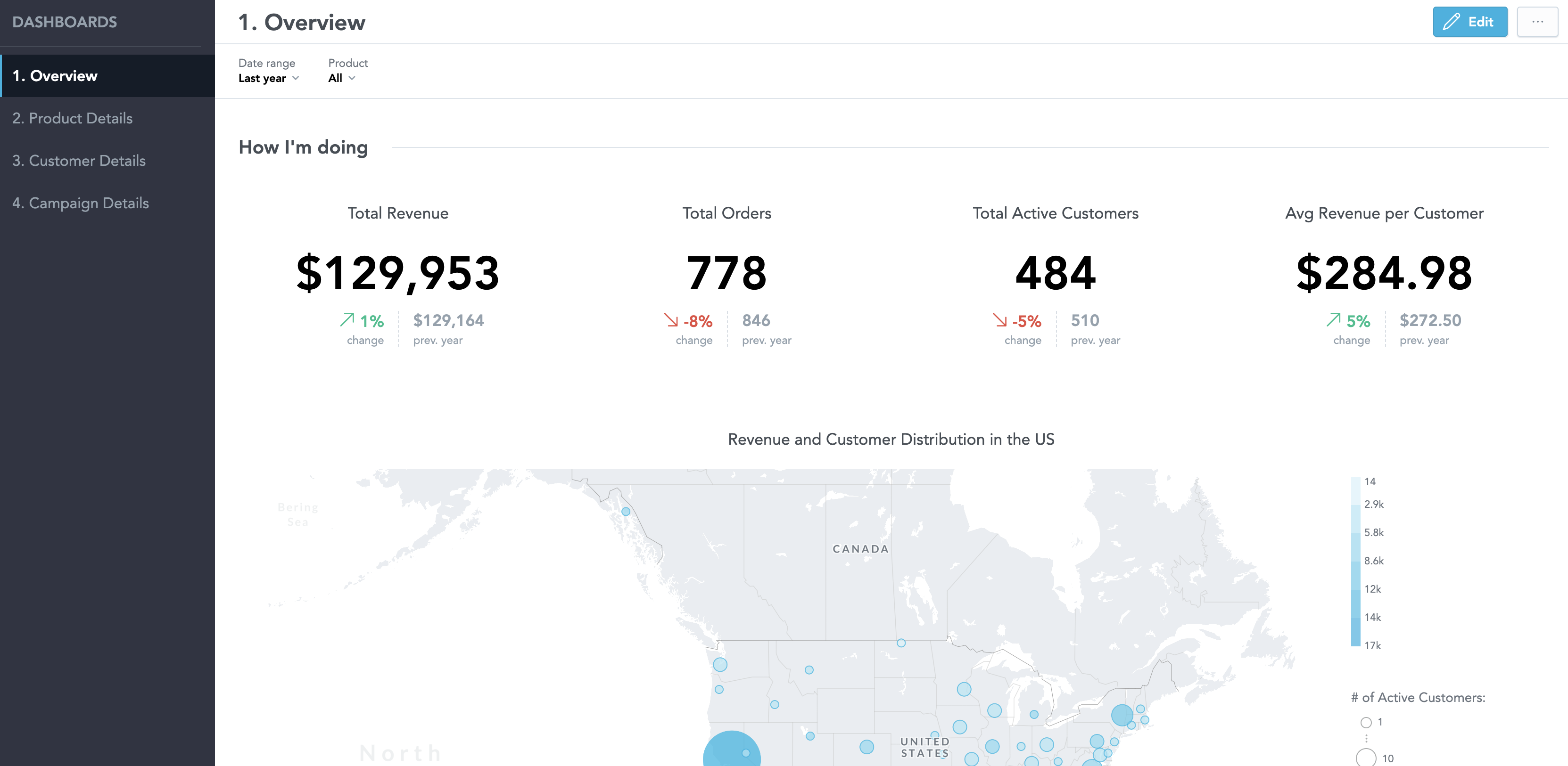
To preserve the demo dashboards, we recommend that you save each dashboard as new from the More Options menu.
Dashboards are interactive. Most of the elements on the dashboard can be affected with your cursor.
You can quickly change the time frame for the displayed data for all elements in the dashboard by changing the date range in the View mode:
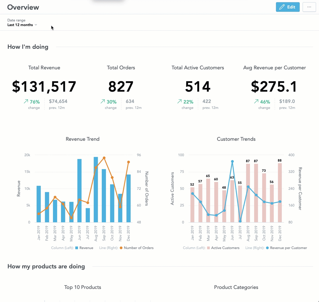
To exclude individual elements from being affected by the filters, access the Edit menu. From the Edit menu, Select More Options for the element, Configuration, and untick the filter you want the element to ignore.
Demo Insights
The Analyze tab is where you can use the Analytical Designer to create and edit the insights for your dashboards. The Demo Workspace comes preloaded with insights to help you understand how to create your own. This section contains examples of a few of the demo insights provided to you.

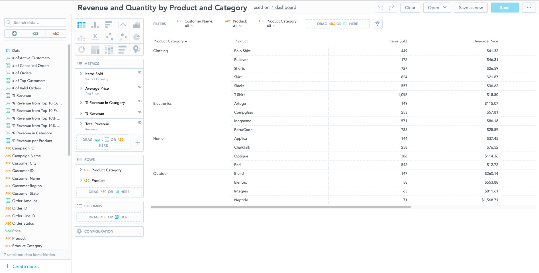
To access the demo insights, select Open and then select the insight you want to view. After you open a saved insight, you can find which dashboards use the insight.

To avoid affecting your dashboards, consider selecting Save as new before modifying an insight.
Percentage of Customers by Region
Chart type: Stacked area
Purpose: Analyzes the share of customers in sales regions over the last 12 months.
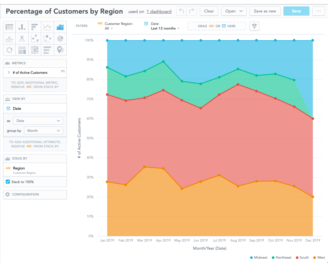
In the VIEW BY section, you can change the date granularity and group the data by quarter. You can also apply regional filters.
Revenue by Category Trend
Chart type: Line Chart
Purpose: Shows revenue trends as shares per product category since data collection began.
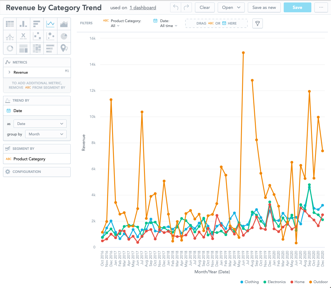
Under Configuration, you can change the Colors. Under Canvas, you can adjust whether the line graph displays the Data Points.
Product Revenue Comparison (over previous period)
Chart type: Column chart
Purpose: Compares revenues per product category in the last 12 months with the revenues from the previous 12-month period.
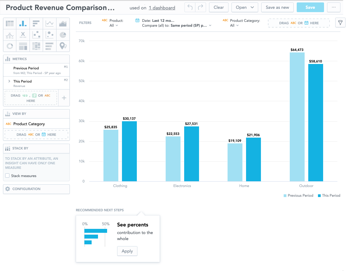
The column will occasionally recommend different ways to analyze your data. Select Apply to view the change. If the change is undesired, you can select the Undo arrow.
Campaign Spend
Chart type: Treemap
Purpose: Offers a visual map of resources spent per campaign category and name.
Resize your browser window to view the tags directly on the map. Alternatively, hover your mouse over the individual tiles to see the contents.
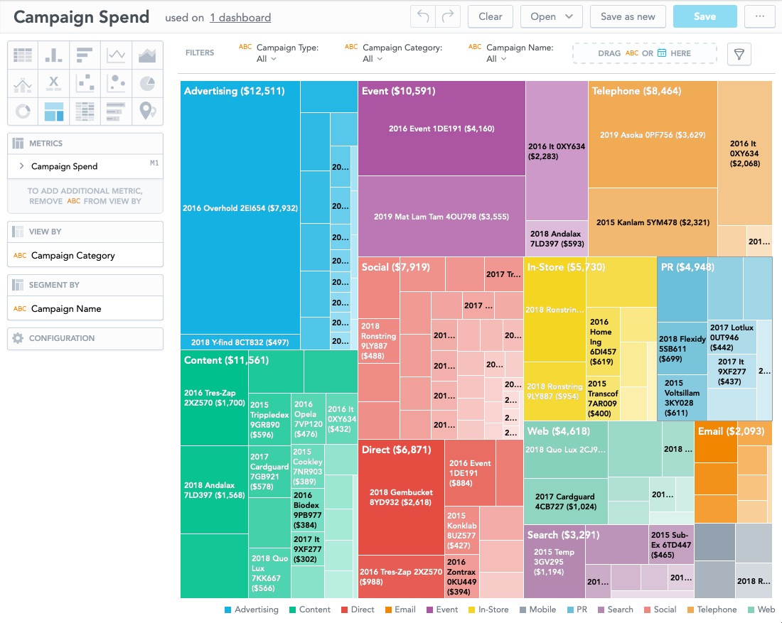
You can toggle the Legend under Configuration.
Revenue per $ vs Spent by Campaign
Chart type: Scatter plot
Purpose: Explores which campaign was the most effective in terms of revenue per every dollar you spent.
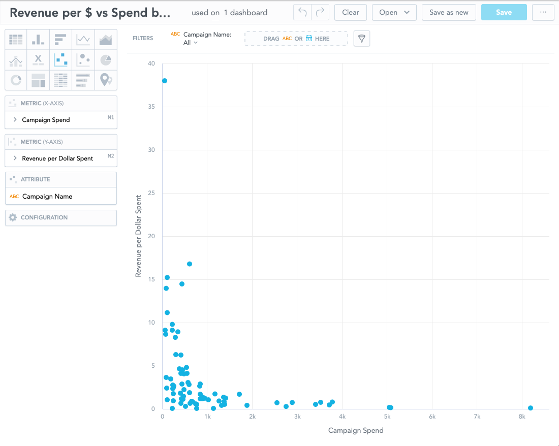
To switch the axis, drag and drop the fact from the Metric (Y-AXIS) (Revenue per Dollar Spent) onto to the Metric (X-AXIS).
Revenue Trend
Chart type: Combo chart (columns + lines)
Purpose: Explores the correlation between revenue and the number of orders over time.
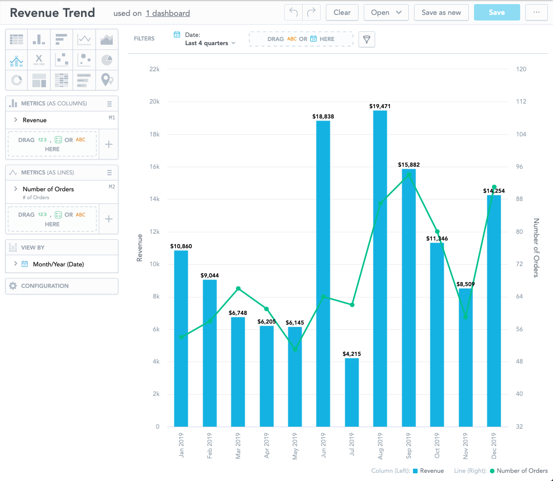
To adjust the density of the data visualization, change the options in the VIEW BY field. Additional objects can be dragged and dropped onto the FILTERS bar for more detailed analysis.