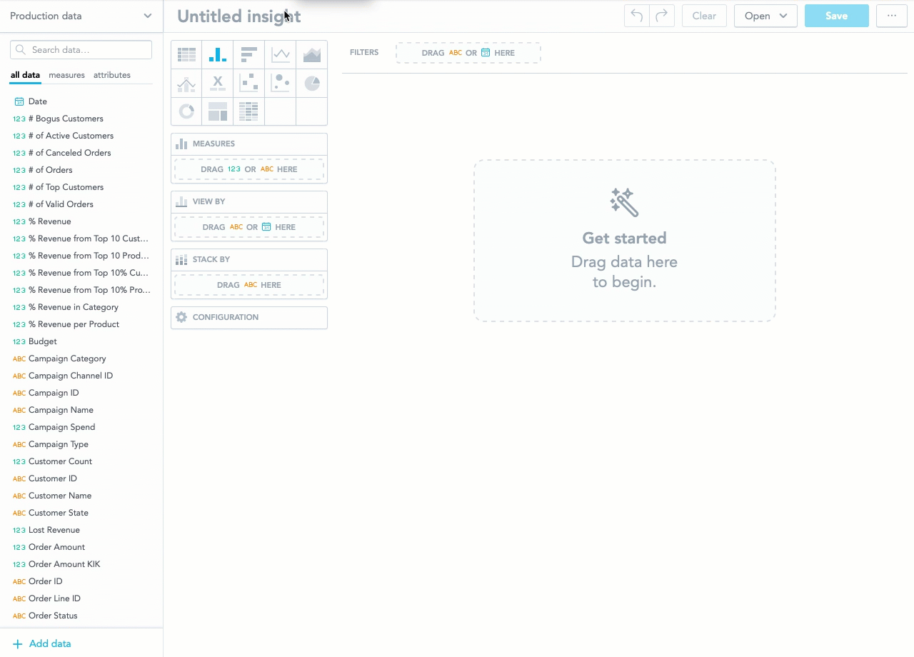
Create an Insight
The data in your demo workspace provide a comprehensive history of purchases, campaigns, revenues etc. We encourage you to experiment with available facts, metrics, and attributes to see how GoodData works and visualizes the story behind the analytics.
This article will explain how to create a revenue per quarter insight using Analytical Designer in the Analyze section.
Data in the Demo Workspace are date-based and refreshed on regular basis. The actual values displayed in your dashboards may be different.
Create an Insight
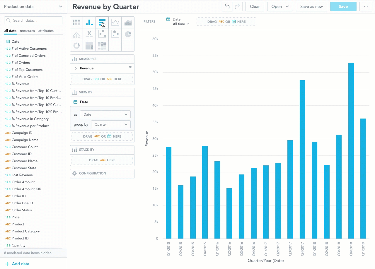
In this exercise you will construct an insight that will show you your revenue per quarter since the data collection began.
Review the animation to see the process, then follow the procedure list below.
Steps:
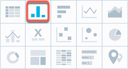
- Select the Column chart as your insight type.
- Find the Revenue metric in the Production data column on your left-hand side.
- Drag and drop it onto the METRICS section.
- Find the Date element and drag and drop it onto the VIEW BY section. Your Revenue visualization is broken down by Date’s default setting to show your annual revenue stream.
- In the VIEW BY section, change the Date’s group by attribute to Quarter.
- Name your insight Revenue by Quarter and click Save.
Slice and Refine
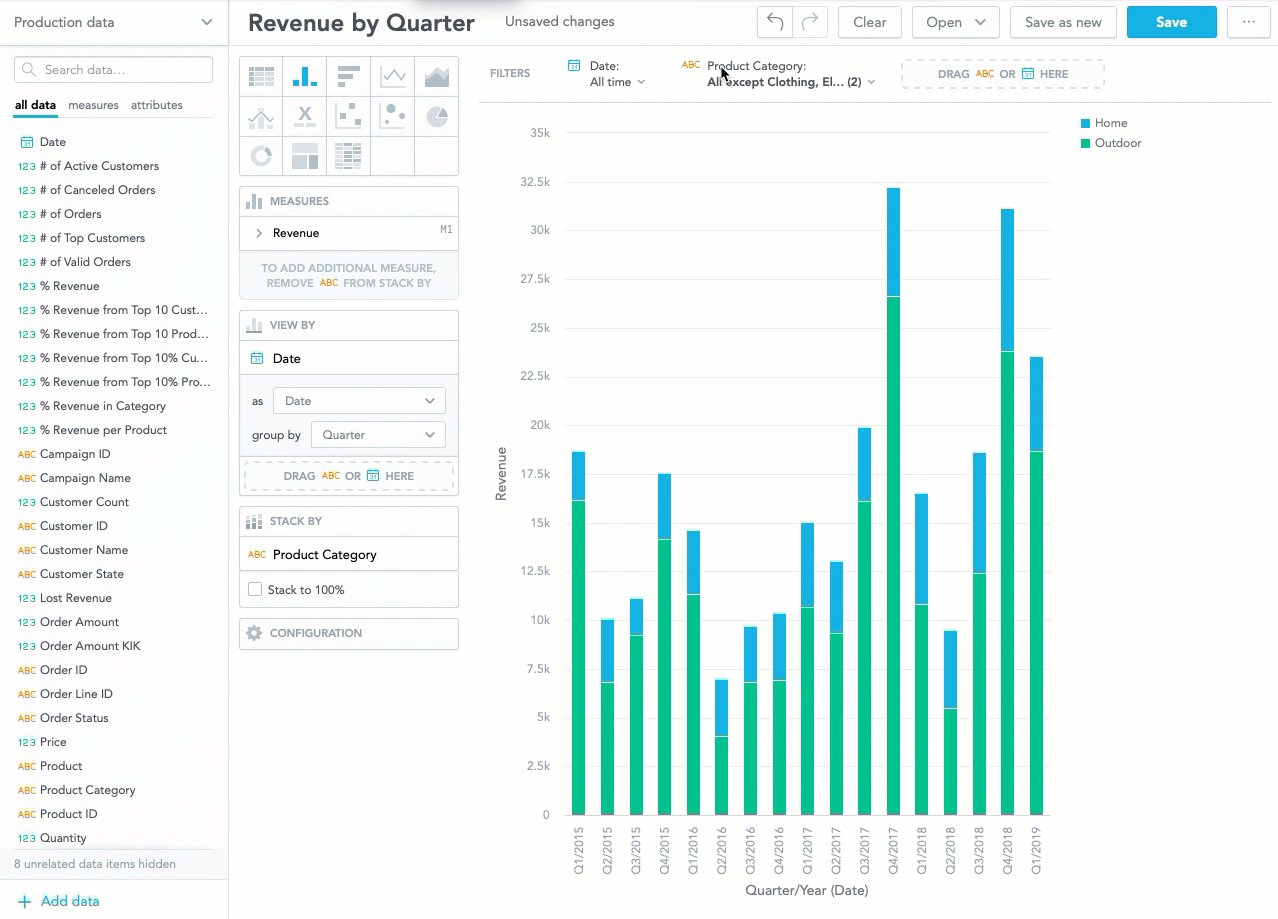
You can change the visualization types and add various attributes to the VIEW BY or STACK BY section.
You can add the Product Category attribute to the STACK BY section and then use it as a filter to restrict the insights to just two selected categories, for example Home and Outdoor. You can then save the insight as Revenue in Home and Outdoor.
Watch the following animation to see how to change the visualizations of your insights and apply filtering.
To remove an element that you dropped onto, for example, the STACK BY section, drag it back to Production data column.
Next Steps
While insights are a comprehensive analytical tool, sometimes all that you need is a single number, a trend or a helicopter overview of KPIs to see how your or your clients' business is doing.
Proceed to Build Dashboards to learn how to turn your insights into comprehensive KPI dashboards.