Sankey Diagrams
This visualization is currently an opt-in feature. To enable this feature, follow the Configure Various Features via Platform Settings article. Note that if you are using GoodData.UI for custom apps and plugins, this feature is not going to be supported until GoodData.UI version 9 becomes available.
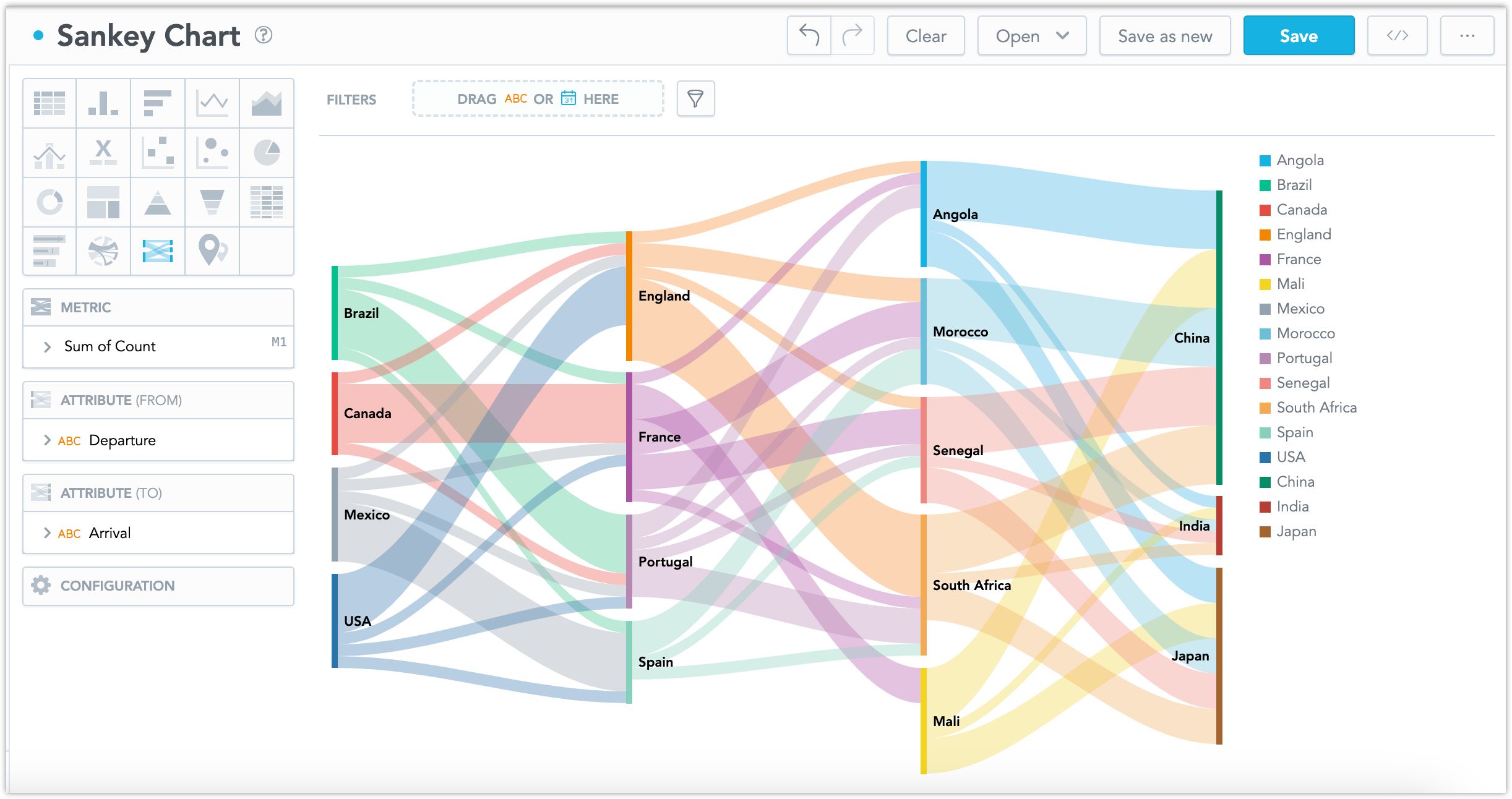
Sankey diagrams show the flows of values from one category to another. For example, a sankey diagram can show the movement of goods at each stage of a supply chain, such as production, transportation, and consumption. This makes it useful for highlighting trends and resource optimization.
Sankey Diagrams have the following sections:
- Metrics
- Attribute (From)
- Attribute (To)
- Configuration
You can also display the values as a percentage of the total sum. To do so, check the Show in % checkbox in the Metric section.
This diagram cannot show a circular movement. If 2 nodes are both a source and a target to each other, for example representing flights from airport A to airport B and then back to A, the diagram will not be properly generated. It is therefore necessary that your data sources contain only values relevant to the flow in one direction.
For information about common characteristics and settings of all visualizations, see the Visualization Types section.