You are viewing our older product's guide. Click here for the documentation of GoodData Cloud, our latest and most advanced product.
Line Charts
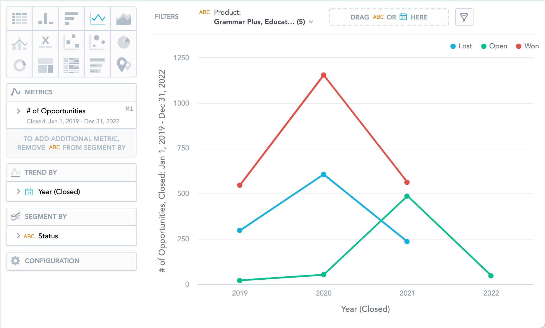
Line charts can display changes in metrics across time or progress across a series of stages.
Line charts have the following sections: Metrics, Trend by, Segment by, and Configuration.
If you configure the Trend by section and add Date or Attribute, you display a trend line. Trend lines connect individual metric/attribute values.
In line charts, you can also:
- Display the values as a percentage. You must add Dates or Attributes to the Trend by section.
- Display individual values of an attribute. Add an attribute to the Segment by section and must have only a single item in the Metrics section.
- Display the chart as a continuous line even if some values are missing. To do so, check the Continuous line checkbox in the Configuration > Canvas section. If checked, the line skips the missing value and connects the next available value.
- Compare your data to previous period or same period of the previous year. For details, see Time over Time Comparison.
- Slice your data by Date or Attribute. You must add Date or an Attribute to the View by section.
- Display a secondary y-axis on the right side. You must select the show on right axis checkbox in the metric settings.
For information about common characteristics and settings of all insights, see Insight Types.