Geo Charts (pushpins)
Geo charts (pushpins) show you data that are broken down geographically. They show data points as bubbles using the coordinates from the location attribute. In addition, geo charts can display the size of the bubbles in proportions using another metric. If you add an attribute to the Segment by section, the bubbles get different colors for each value.
Geo charts (pushpins) have the following sections: Location, Metric (Size), Metric (Color), Segment by, and Configuration.
For information about common characteristics and settings of all insights, see Insight Types.
To set a specific part of the map to be seen when you open the insight, go to Configuration → Map → Default viewport and select a part of the map.
For configuration options common for all insights, see Configure Insight Properties.
Configure data for geo charts
For information about the preparation of data for geo charts (pushpins), see Configure Data for Geo Charts (pushpins).
Examples
Location display
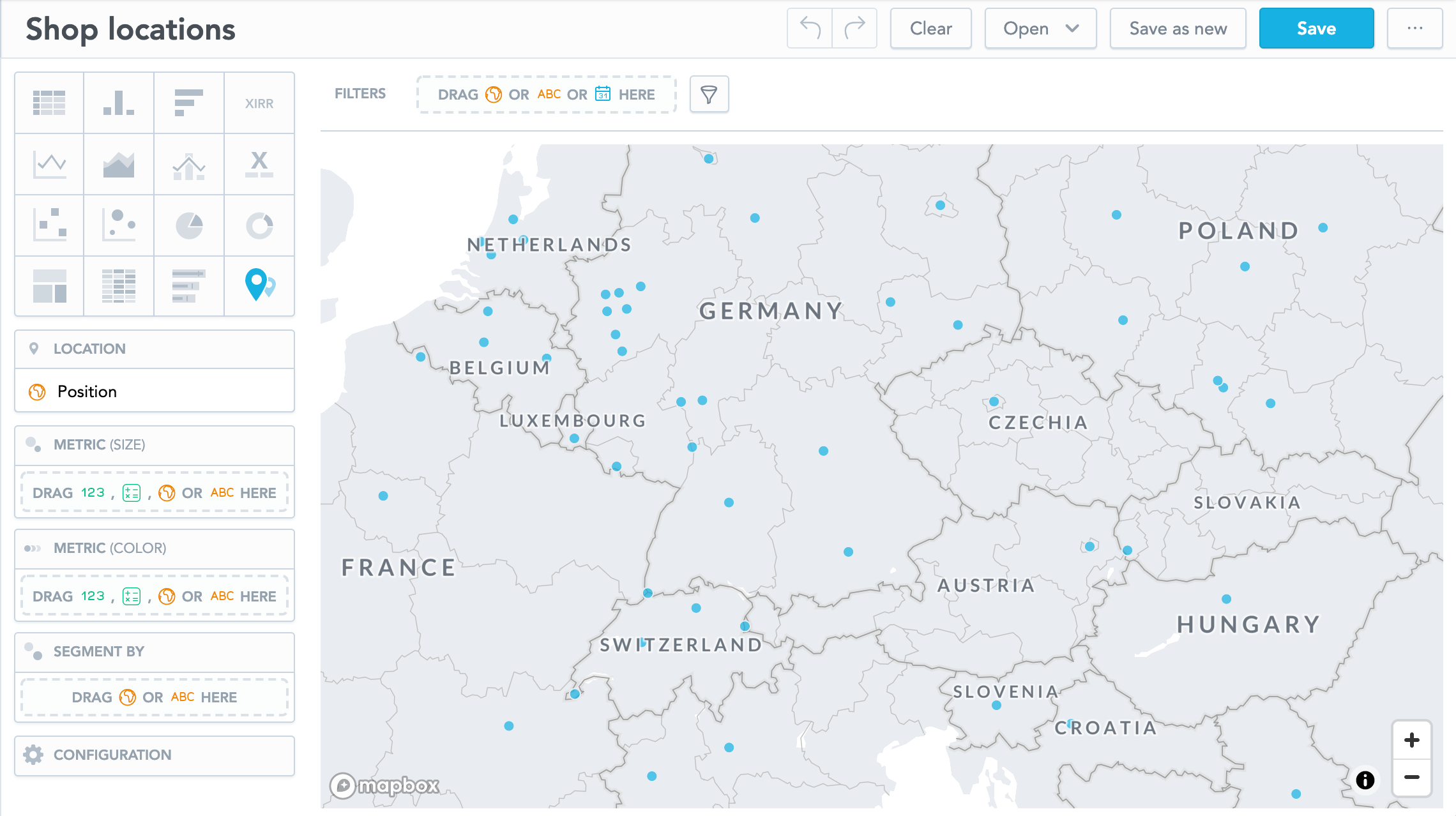
This example displays how the shops are distributed.
Put the Position attribute in the Location section. Each dot represents a location where a shop is located. All dots have the same size.
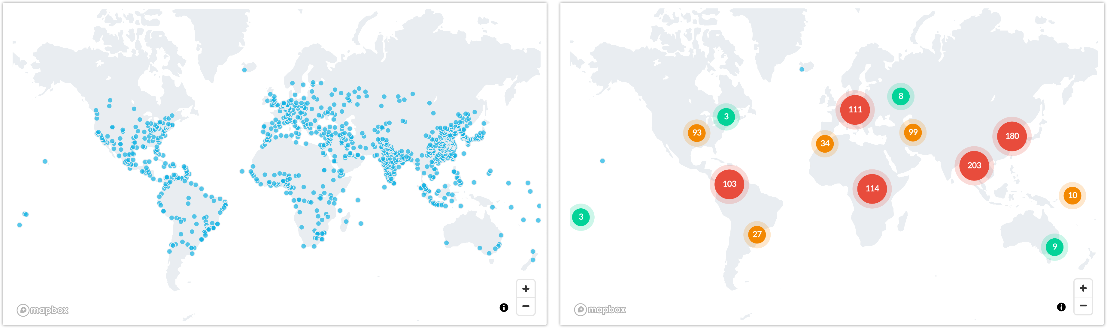
For large maps, you can group nearby points so that the displayed map is not overcrowded. In the Configuration section, go to Points and select Group nearby points.
The following images show identical data - ungrouped and grouped.
Dot size based on value
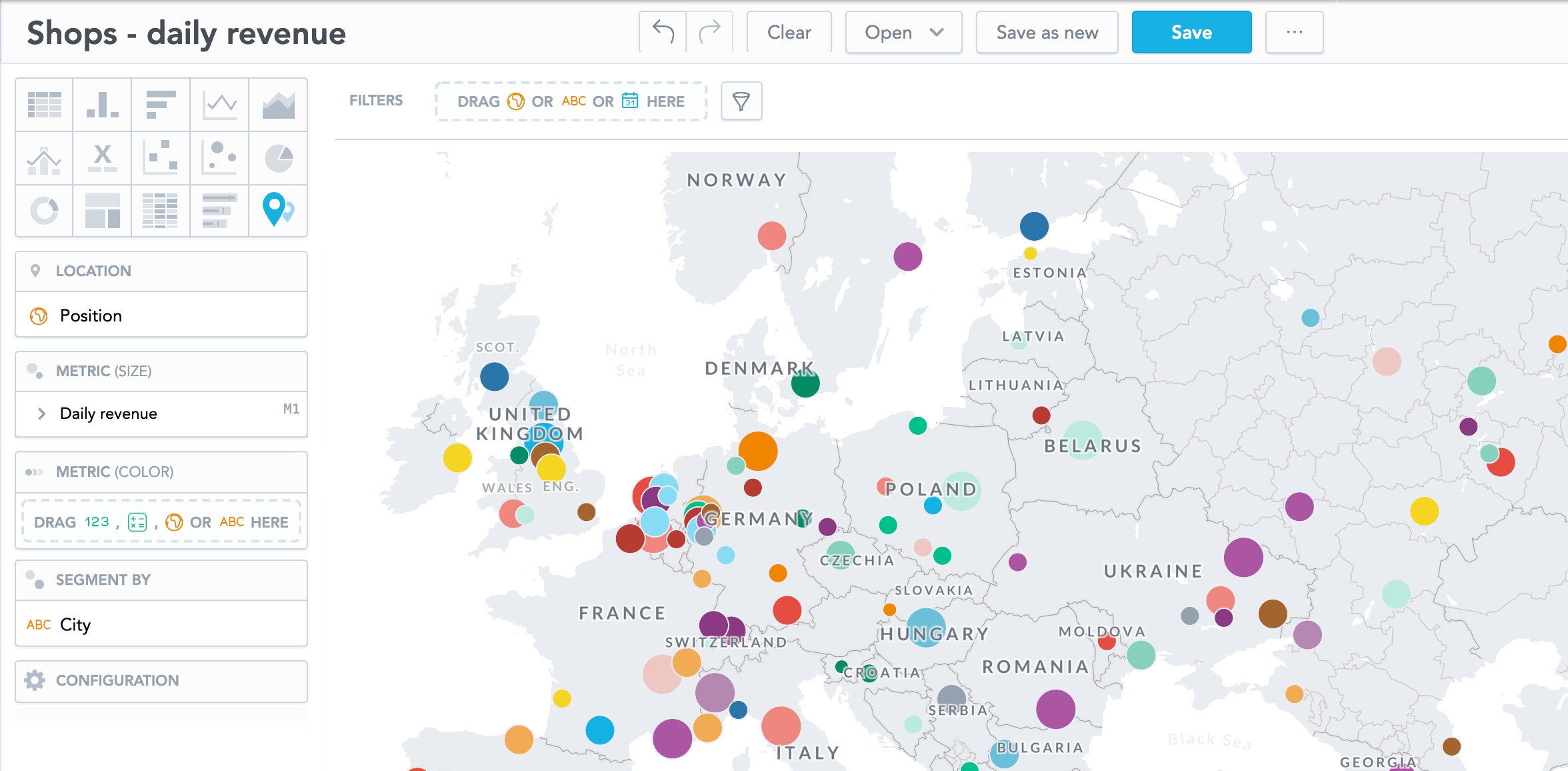
If you want to see a different size of the dots based on the metric value, add a metric to the Metric (size) section.
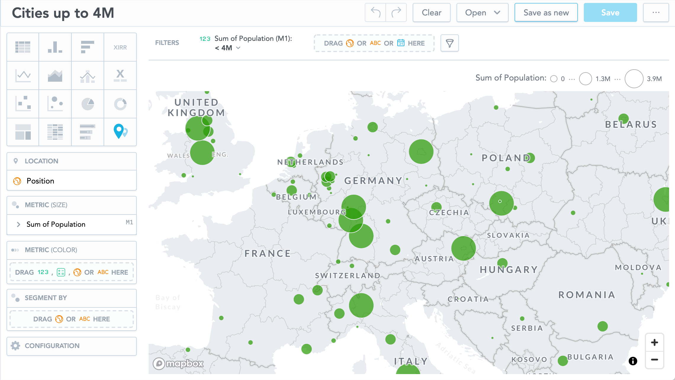
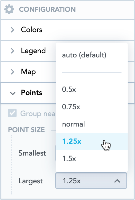
To adjust the size of the smallest and largest dots, go to Configuration → Map → Points and select the value in the drop down menus.
Dot color shade based on metric value
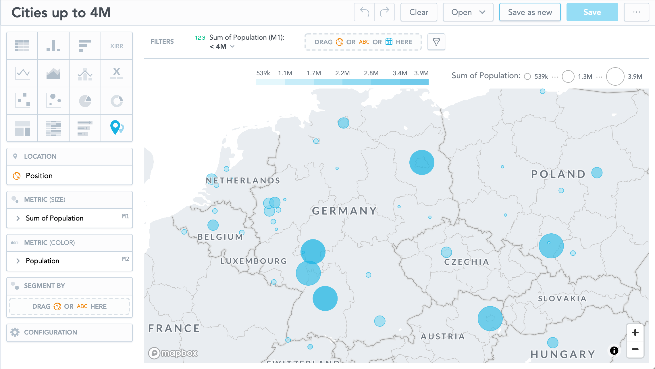
If you put an item to the Metric (color) section, the data display different shades of the color based on the metric value.
Dot color based on attribute value
If you put an attribute to the Segment by section, the data display different color for each attribute value.
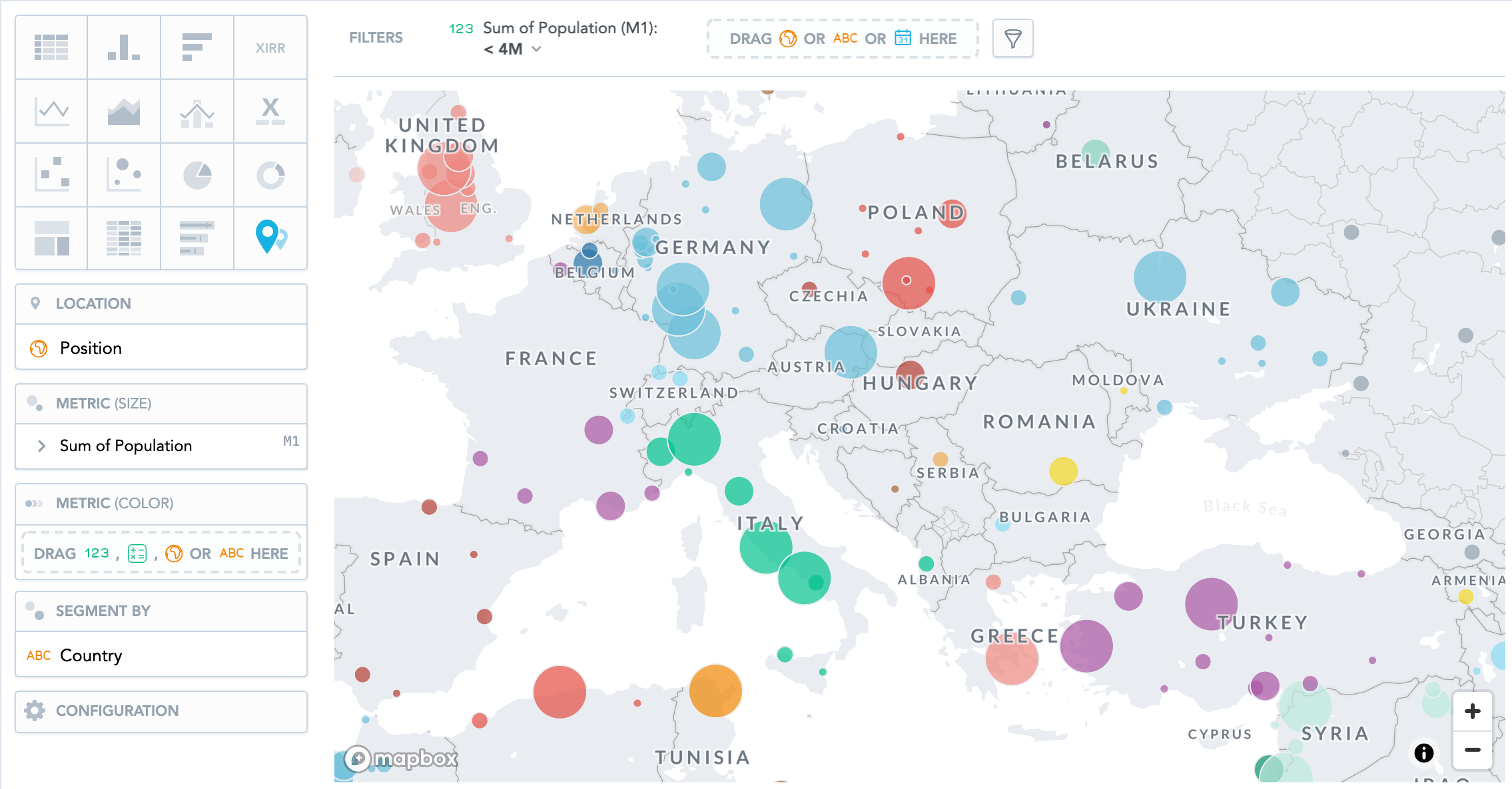
The following image shows population in cities segmented by country.