You are viewing our older product's guide. Click here for the documentation of GoodData Cloud, our latest and most advanced product.
Combo Charts
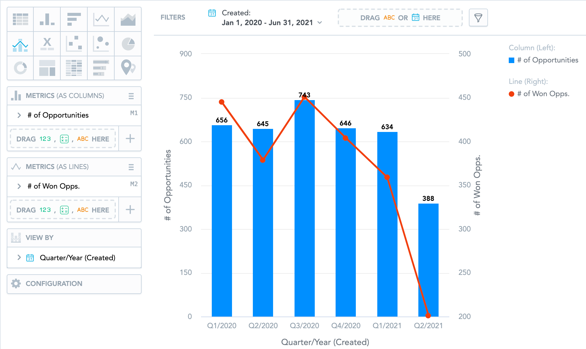
Combo charts combine two types of charts - column, area, or line - into a single insight. You can compare your sales numbers to your target or two metrics with different value ranges.
Combo charts have the following sections: two Metrics (as columns/lines/area) sections, View by, and Configuration.
Combo charts can:
- Display the values as a percentage. You must add Date or an attribute to the View by section.
- Display the chart as a continuous line even if some values are missing. To do so, check the Continuous line checkbox in the Configuration > Canvas section. If checked, the line skips the missing value and connects the next available value.
- Compare your data to previous period or same period of the previous year. For details, see Time over Time Comparison.
- Display a secondary y-axis on the right side. You must select the show on right axis checkbox under the hamburger icon in the second Metrics section.
For information about common characteristics and settings of all insights, see Insight Types.
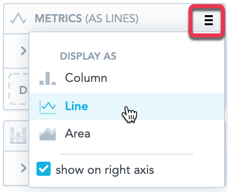
To change the insight types used in your combo chart, click the hamburger icon next to the Metrics title and select the insight type for the particular metric.
In combo charts, the data is sorted by the values in the View by section.