You are viewing our older product's guide. Click here for the documentation of GoodData Cloud, our latest and most advanced product.
Bubble Charts
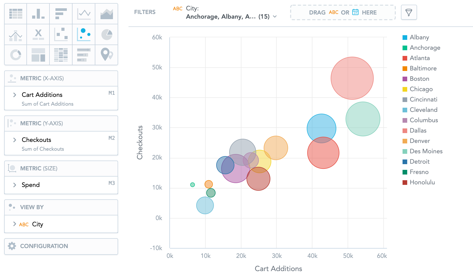
Bubble charts are similar to Scatter plots. They show data points as bubbles using Cartesian coordinates. In addition, bubble charts can display the size of the bubbles in proportions using a third metric. If you add an attribute to the View by section, the bubbles get different colours for each attribute value.
Bubble charts have the following sections: Metric (X-axis), Metric (Y-axis), Metric (Size), View by, and Configuration.
For information about common characteristics and settings of all insights, see Insight Types.