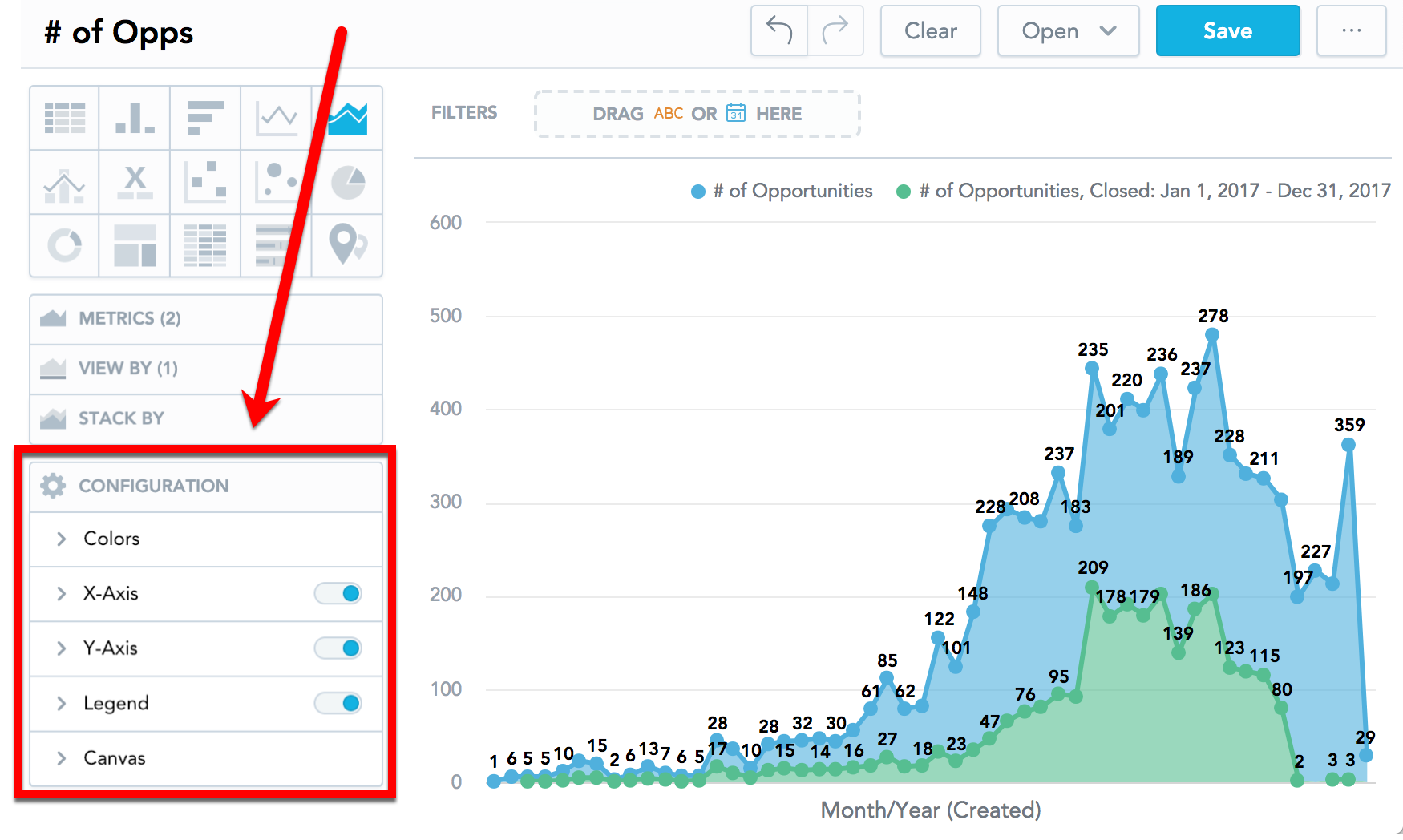
Configure Insight Properties
Analytical Designer allows you to change the default properties of your insights. You can show or hide axes, disable gridlines, rotate labels, change colors, and so on.
You can change the properties in the Configuration section when creating an insight.
Axes
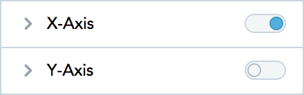
To hide or display axes, toggle the switch for the X-axes and Y-axes.
 If you enable a secondary axis for bar charts, column charts, or line charts, you can configure the secondary axis here as well. For details about secondary axes, see Bar Charts, Column Charts, and Line Charts.
To hide or display the axis name, toggle the switch for Name.
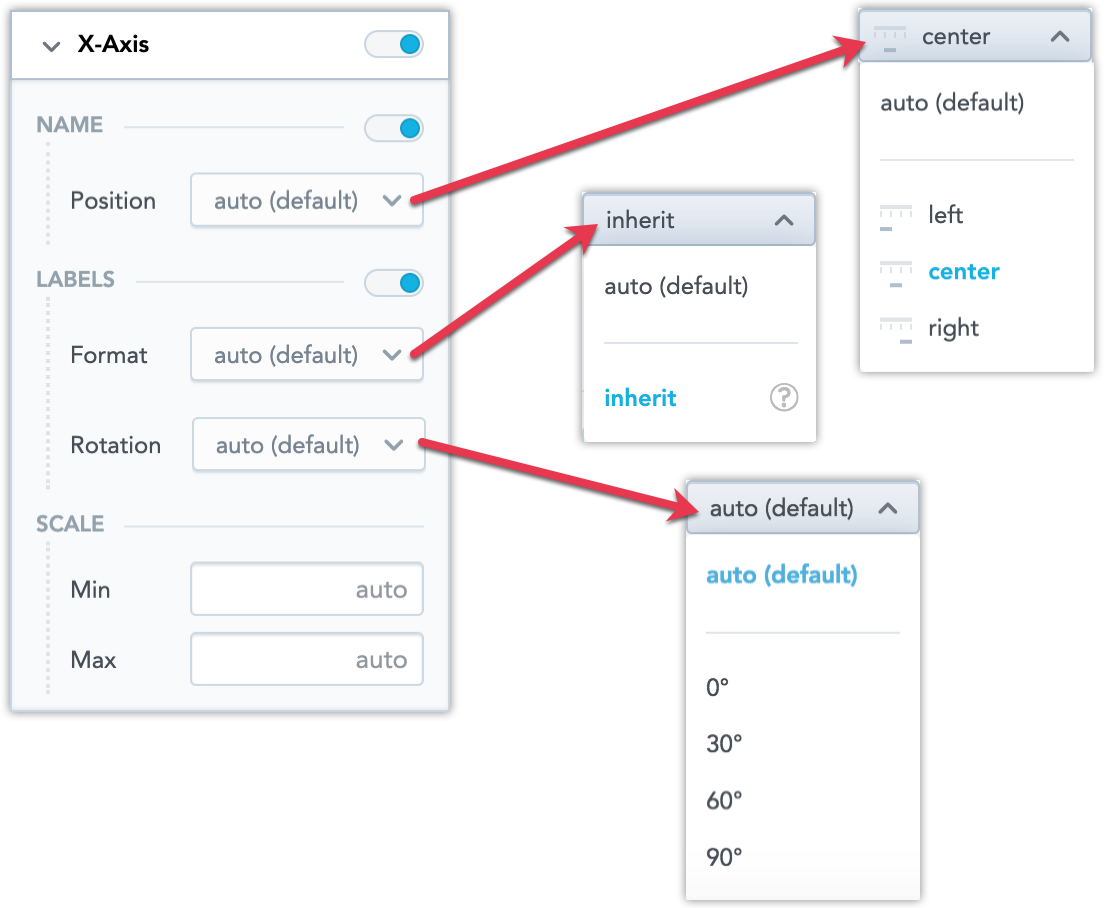
To change the axis values display angle, select the angle in the Rotation dropdown list.
To change the format of label values, select inherit from the Format dropdown list. The label inherits the format from the first fact/metric in the insight. For details about formatting, see Format Numbers.
To change the axis name position, select an option in the Position dropdown list.
To set the minimum and maximum values for an axis, type the values in the Min and Max fields.
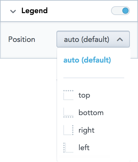
Legend
- To hide or display the legend, toggle the switch in the Legend section.
- To change the position of the legend, select the position in the dropdown list.
If you add insights to dashboards and display them on narrow screens, the legend automatically moves to the top and may be collapsed for better readability.
If you stack your data, the order of the items in the legend always corresponds with the order of the data in your insight - left to right, or top to bottom. See also Stack Metrics.
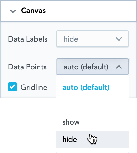
Canvas
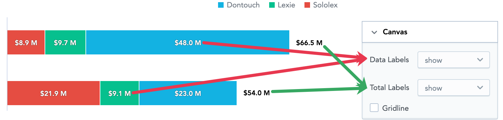
- To show or hide the data labels, select the option in the Data Labels dropdown list.
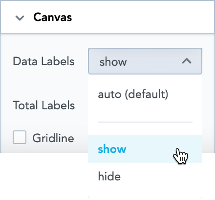
- To show or hide the data labels for totals in bar charts and column charts, select the option in the Total Labels in the dropdown list. This option is available only if you add an item to the Stack by section. See also Stack Metrics.
- To show or hide the gridline, select or unselect the Gridline option.
- To show or hide data points on line, area, or combo charts, select the option in the Data Points dropdown list. If you select auto, Analytical Designer may hide the data points if there are too many.
Custom Color Palette
Analytical Designer includes a predefined set of colors used for items displayed in insights.
If you want to use a different set of colors (for example, your company colors), you can upload a custom color palette via API (see Importing Custom Color Palettes).
Analytical Designer and Dashboards then use your colors instead of the default ones in all current and future insights. The new custom colors are also respected in insights used via GoodData.UI.
You can include any number of colors in your custom palette.
Change Display Colors
Analytical Designer assigns colors for facts, metrics, and attributes in a fixed order. The first fact/metric/attribute in the Metric(s) section is assigned the first color from the palette (the default one or your custom palette).
For each of the fact/metric/attribute in your insight, you can change the color in which the insight displays it. For example, you want to display Opportunities won in green and Opportunities lost in blue.
Steps:
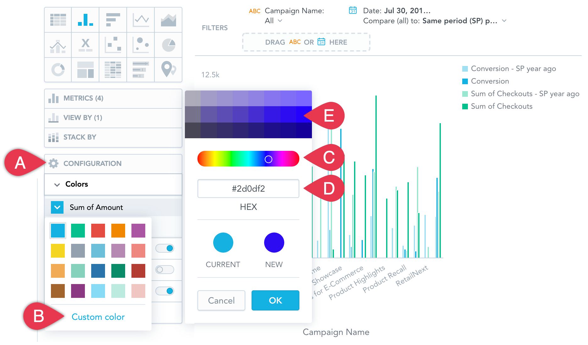
In the Configuration section, click Colors (A in the image above).
Click the fact/metric/attribute that you want to change.
Select a new color, or click Custom color (B) to adjust the current color. You can select another color form the picker (C), enter a hexadecimal code for a new color (D), or select a different shade of your color (E).
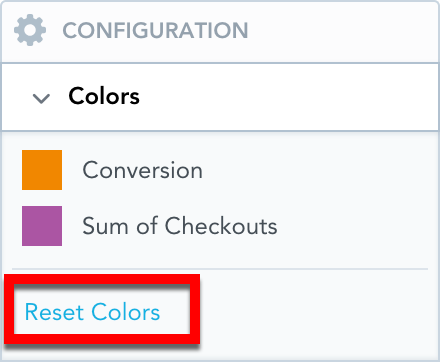
To revert to the original colors, go to Configuration → Colors and click Reset colors.
Example
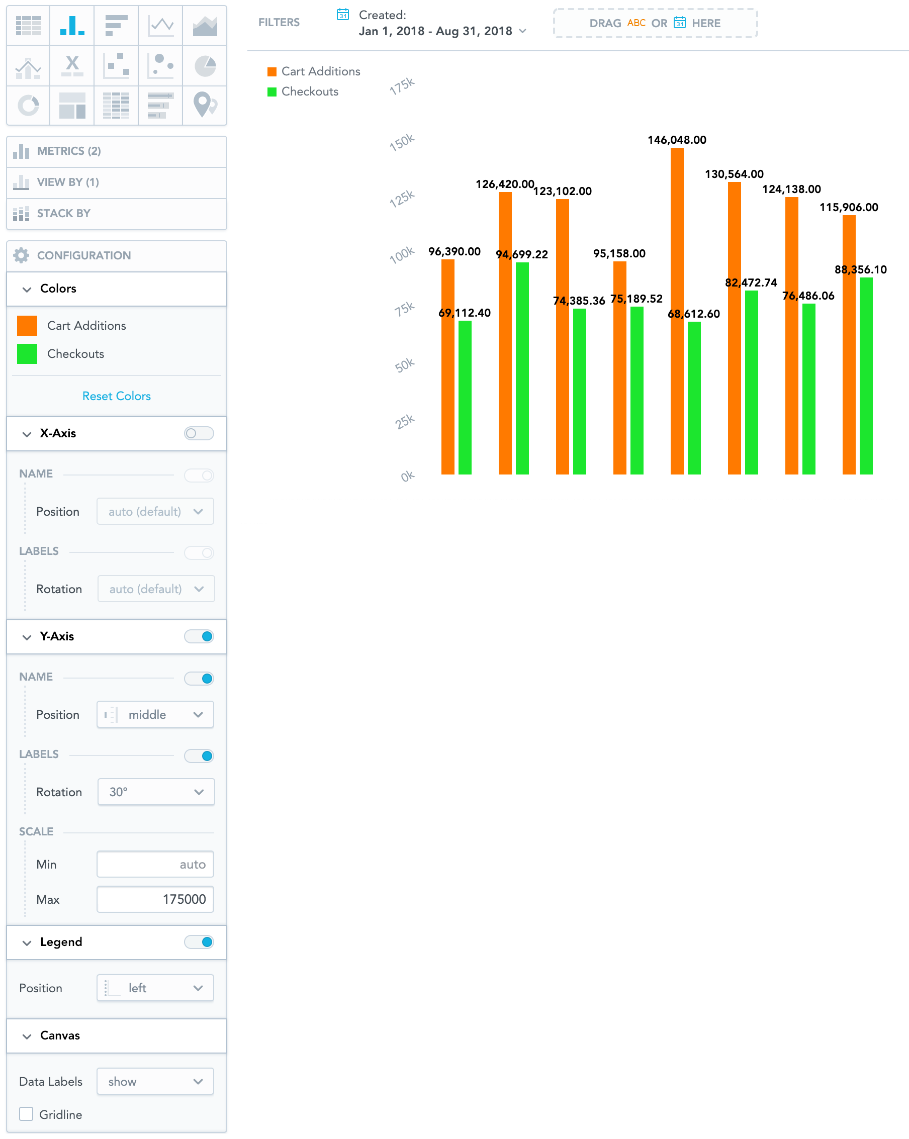
The image below shows a column chart that has:
Colors of both metrics changed
X-axis switched off
Name of Y-axis positioned in the middle
Labels on Y-axis (Left) rotated by 30°
Set the Y-axis (Left) scale from 0 to 175000
Dual X-axes are available for line charts. Dual Y-axes are available for bar charts and column charts. For details, see Bar Charts, Column Charts, and Line Charts.Labels on Y-axis (Right) rotated by 60°
Set the Y-axis (Right) scale from 1000 to 100000
Legend placed to the left of the insight
Data labels displayed
Gridline hidden