GoodData Portal
As a user, you access analytics through the GoodData Portal. GoodData Portal is a secure web interface for querying and displaying analytics reporting. You can access GoodData Portal through a browser on desktop or mobile devices. For more details, see System Requirements and Supported Browsers.
GoodData Portal uses common web standards and is built on JavaScript, AJAX, and HTML.
You can also embed the GoodData Portal functionality into other applications, so that your enterprise reports and dashboards can appear within the context of the applications your users are comfortable using. For details, see Embed GoodData Elements into Your Applications.
The web client does not require additional installation. It is a pure JavaScript client that interacts with the GoodData platform using REST API calls and periodically updates itself through asynchronous polling. The web client features a model/view/controller architecture.
You can integrate GoodData Portal with your enterprise SSO solution, or you can use the GoodData SSO solution. For details, see Set up User Authentication and SSO.
You can replace the GoodData branding with your enterprise’s branding elements. For details, see White Label Your Domain.
GoodData Portal Interfaces
GoodData Portal includes two interfaces:
- Responsive user interface
- Pixel-perfect user interface
Responsive User Interface

The Responsive user interface is designed to be used wherever you need: on desktops and mobile devices.
In the Responsive UI, you can create Insights in Analytical Designer (the Analyze section). You can add them to KPI Dashboards (the KPIs section) to display multiple insights at once. Apart from insights, KPI Dashboards can also display key performance indicators (KPIs).
Insights are defined sets of facts, attributes, metrics, and filters that visualize your data. You can visualize your data in tables and various types of charts.
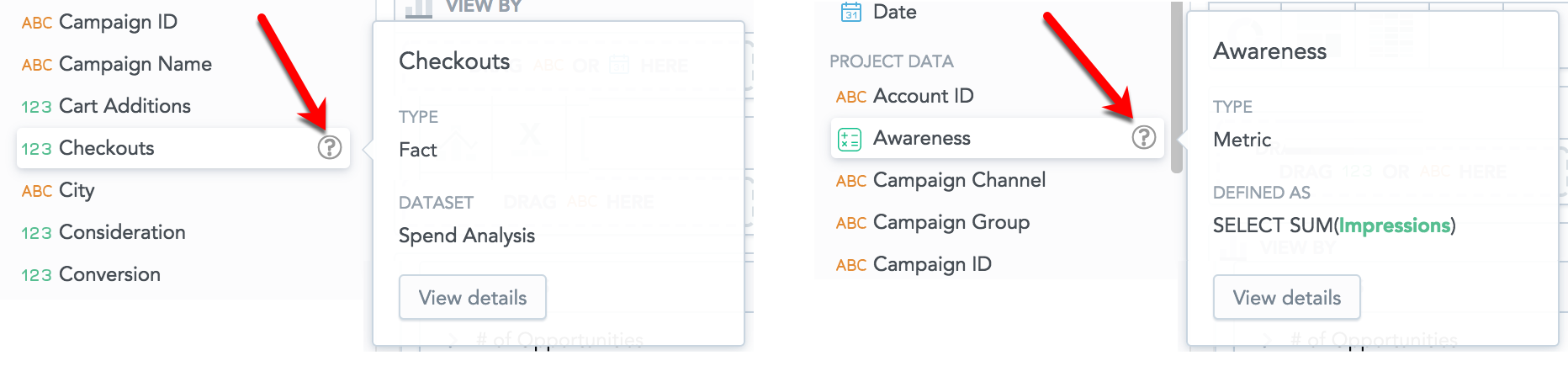
Hover your mouse over the question mark next to the item name in the Data Catalog to see the details.
Learn more:
Pixel-perfect User Interface

The Pixel-perfect interface is designed to analyze detailed data.
In the Pixel-perfect UI, you can create Reports that you can add to Dashboards to display multiple reports at once. Apart from reports, dashboards can also display key metrics and geo charts, and you can add text, graphics, and additional web content.
To give the Dashboards section a new modern look, use the platform settings (see “Switch to the new look-and-feel of the Dashboards section” in Configure Various Features via Platform Settings).
Reports are defined sets of metrics, attributes, and filters that visualize your data. You can visualize your data in tables, bar charts, area charts, funnel charts, and so on.
In the Manage section, you can manage your datasets, metrics, and variables, you can schedule dashboard and report emailing and invite users into your workspace.
Learn more:
Enable and Disable Sections of the Portal Interfaces
You can disable particular sections of the Portal interfaces:
- Analytical Designer (the Analyze section)
- KPI Dashboards (the KPIs section)
- Pixel-perfect dashboards and reports (the Dashboards and Reports sections)
When a section is disabled, its link is hidden from the top header.
For more information about how to disable and re-enable individual sections, see Configure Various Features via Platform Settings.