Creating Metrics and Reports
This topic is part of the tutorial that is intended for developers who plan to work on data models and ETL using CloudConnect.
If you are interested in creating reports, dashboards, or metrics, start with [Reporting and Dashboards]{.ul}.
CloudConnect is a legacy tool and will be discontinued. We recommend that to prepare your data you use the GoodData data pipeline as described in Data Preparation and Distribution. For data modeling, see Data Modeling in GoodData to learn how to work with Logical Data Modeler.
This part of the tutorial will guide you through the process of defining metrics and creating reports.
Metrics are numerical values that can be either summarizations of facts or individual numerical records. Metrics ‘summarize’ individual numerical records by aggregating fact values with functions such as SUM (sum), MAX (maximum value), MIN (minimum value), and AVG (mean).
In some cases, attribute values can also be aggregated into metrics. For example, a COUNT of the ‘City’ attribute with the values ‘San Francisco’, ‘Los Angeles’, and ‘New York’ would return 3: SELECT COUNT(CITY)
The query language that that is used to define custom metrics is GoodData’s Multi-dimensional Analytic Query Language (MAQL). For more information about MAQL, see MAQL - Analytical Query Language.
You create reports in the Report Editor. The Report Editor allows you to determine what metrics your report will compute and display and how report metrics will be broken down by attributes that have been selected to categorize and contextualize your data. All reports have at least one metric and typically one or more attributes (except for headline reports). You can also add filters to your reports that determine what data goes into computing your report metrics (for example, only data relating to opportunities that closed in the third quarter of 2012).
Creating a Report and the First Metric
Steps:
Log in to the GoodData Portal, and click Reports on the top of the page. The Reports page opens. The Reports page displays all reports in the project, if any exist. Because this is your first time using the project, no reports are listed yet.
Click Create Report. The Report Editor opens.
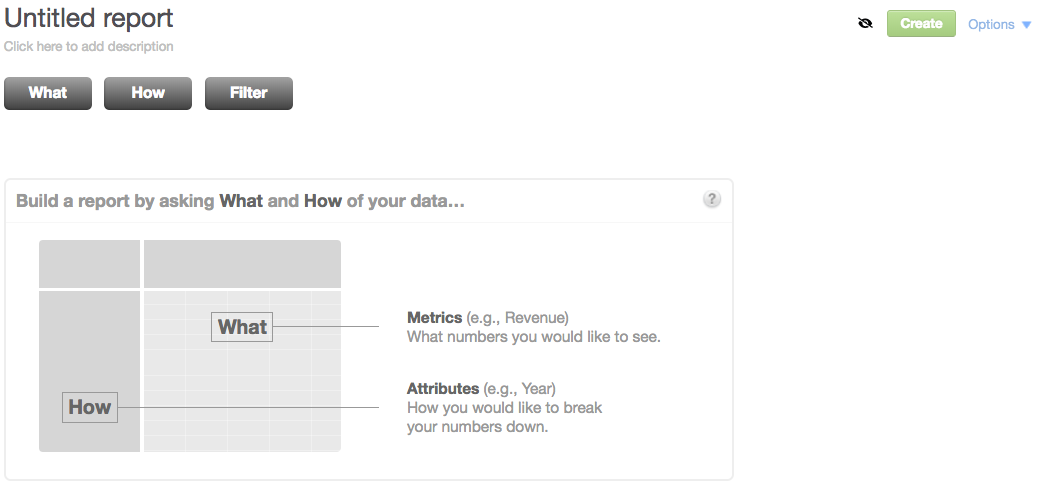
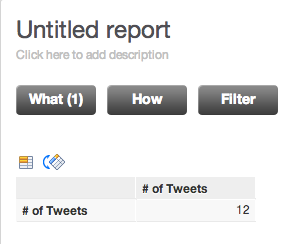
Click What. A pane with all your project metrics opens. Because this is your first time using the project, no metrics are listed yet. You are now going to create a new metric. This metric should count the instances (or values*)* of an attribute called ‘Text’.
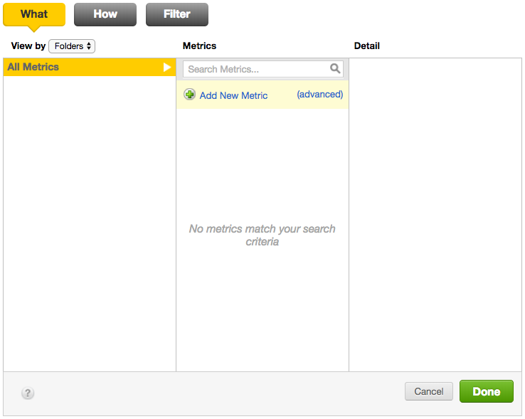
Click Add New Metric. The Simple Metric Editor opens in the right column.
Do not click the (advanced) link. This link opens the full Metric Editor where you define metrics using MAQL DQL. The full Metric Editor is out of the scope of this tutorial. For more information about MAQL, see MAQL - Analytical Query Language.In the Operation dropdown, select Count.
In the Perform operation on dropdown, select Text. The Text attribute represents the text of individual tweets, so the count of the attribute values returns the number of tweets that have occurred.
Enter the name for the metric, such as ‘# of Tweets’. The metric name helps you and other project users easily find and identify the metric.
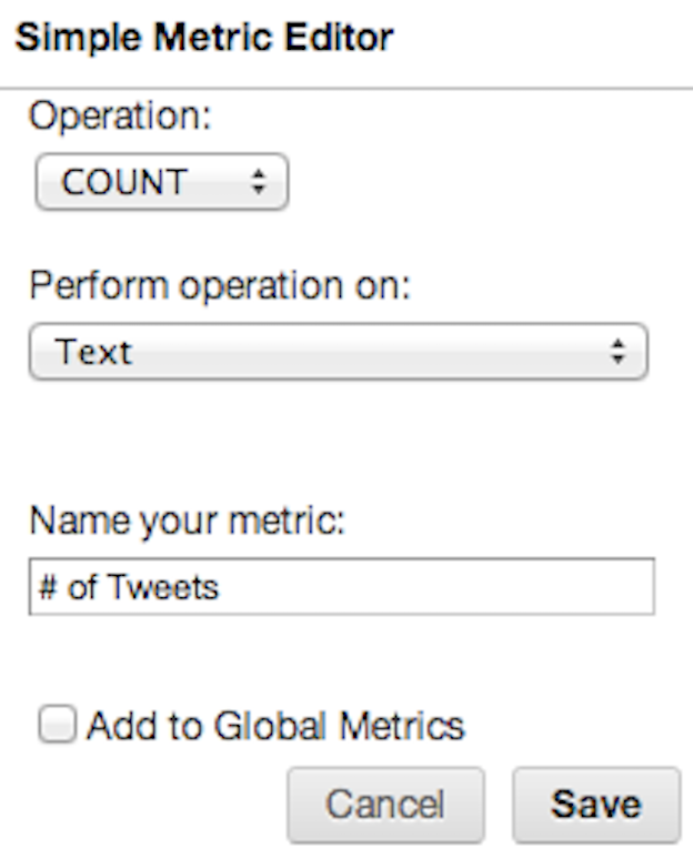
Select the Add to Global Metrics check box. This makes your metric available for use in any reports within the project.
Create a new folder to store the metric in.
(Optional) Click Edit under Default Number Format to change how the metric values are displayed in a report. For more information, see Formatting Numbers in Insights and Reports.
Click Add. The metric is added to your report. Notice that the metric MAQL definition is displayed in the Detail column.
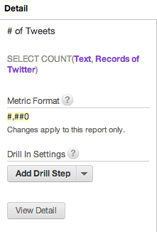
Click Done. The metric is added to your report and is presented as a single aggregated numerical value, within a single cell in a table.
Adding More Metrics to the Report
To add additional metrics to your report, click What to open the metric pane, and then click Add New Metric.
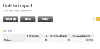
Create two more metrics using the SUM operation to aggregate the project facts ‘Retweets’ and ‘Favorites’. Save the metrics globally and be sure to tag them and add them to a folder called ‘Popular Tweet Totals’ or a similar name so that the metrics are easy to discover later.
We recommend that you name these metrics ‘Total Retweets/Favorites’ or ‘Retweets/Favorites [sum]’ to help users understand that this is a sum of a fact rather than a count of an attribute.
In addition to your first COUNT metric, you now have two more metrics:
- Retweets [sum]
- Favorites [sum]
Adding an Attribute and a Filter
You can now specify attributes to break down and contextualize your report metrics.
You can also add filters to include or exclude certain subsets of data from your report.
Steps:
Click How. A pane with all your project attributes opens.
In the central column, select the ‘Date (tweet)’ attribute to break down the ‘# of Tweets’ metric that you have added to your report earlier.
To quickly locate the attributes you are looking for, use attribute folders or tags in the left column of the How pane. When you click a folder or tag, only the attributes that belong to that folder or have been categorized by that tag appear in the central column. You can also use the search bar to home in on an attribute of interest.
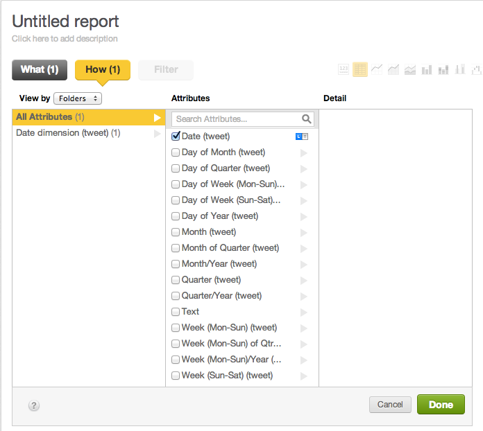
Click Done. The report now displays the ‘# of Tweets’, ‘Favorites [Sum]’, ‘Retweets [Sum]’ metrics sliced by the ‘Date (tweet)’ attribute. Notice how the ‘Date (tweet)’ attribute breaks the report data down by day.
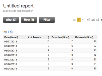
Hover the mouse cursor over the # of Tweets column header. When the downward arrow appears, click it to sort the column values in descending order. This could be useful for correlating social activity around specific marketing activities that occurred on particular dates.
Try other report types: change the report to a bar chart using the Bar chart visualization icon toward the top of the Report Editor.
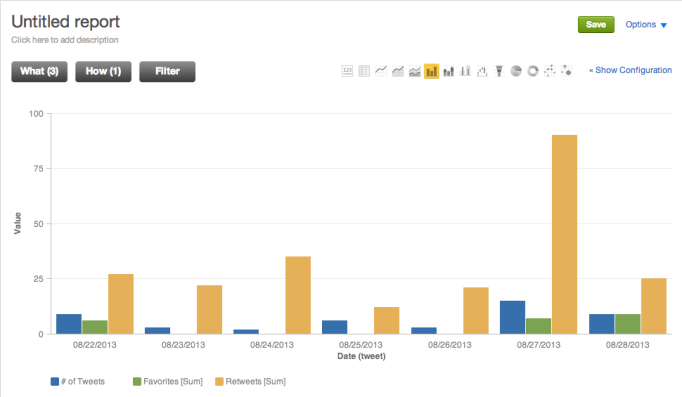
Remove the label along the y-axis: click Show Configuration. The configuration pane appears.
Expand the Axis Y options, un-select the check box beside ‘Name’, and click Apply.
For the time being, our report contains relatively few dates and is easy to read. But as the dataset grows, it may become difficult to read all of the data. This is where a filter could come in handy. You can use a filter to limit the data displayed associated with a certain date range, or you could specify that only the data associated with the dates that saw the highest (or lowest) number of tweets should be displayed.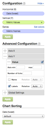
Apply this latter type of advanced filtering to your report: click Filter. The filter pane opens.
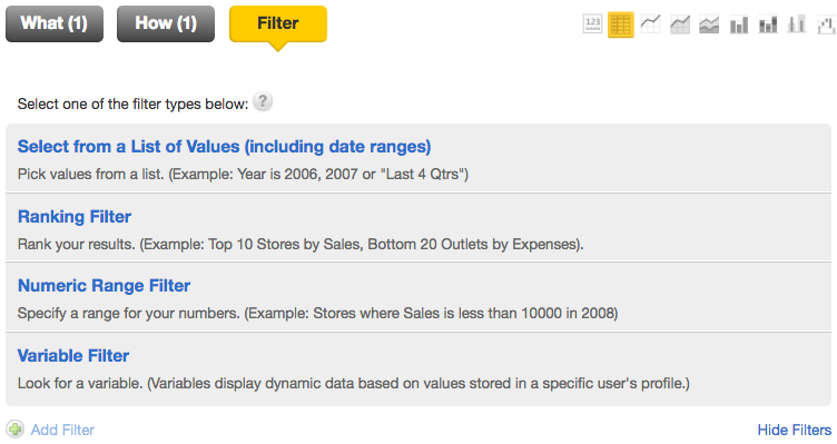
Click Ranking Filter.
For the result size, select the Top option button.
Use the dropdown to select the value ‘10’. This specifies that only the top 10 dates (according to the number of tweets) will be displayed.
For the attribute to rank, select the ‘Date (tweet)’ attribute to rank by date.
For the ranking criteria, select the ‘# of Tweets’ metric.
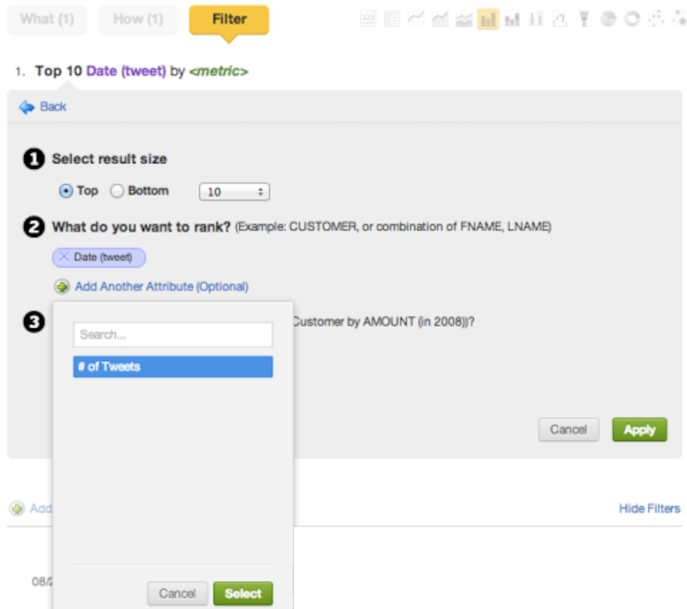
Click Apply. The filter settings are applied. You are returned to the report. You are now ready to save the report.
Click Create. A dialog opens, and you are prompted to fill in the report properties.
Name your report so that you and other project users can easily find and identify it later on; for example, ‘Top 10 Tweet Dates’. You can also add a description that will be accessible from the Report Directory and from dashboards where the report appears. Use tags to help others discover your report, or add your report to a folder to better locate it in the future.
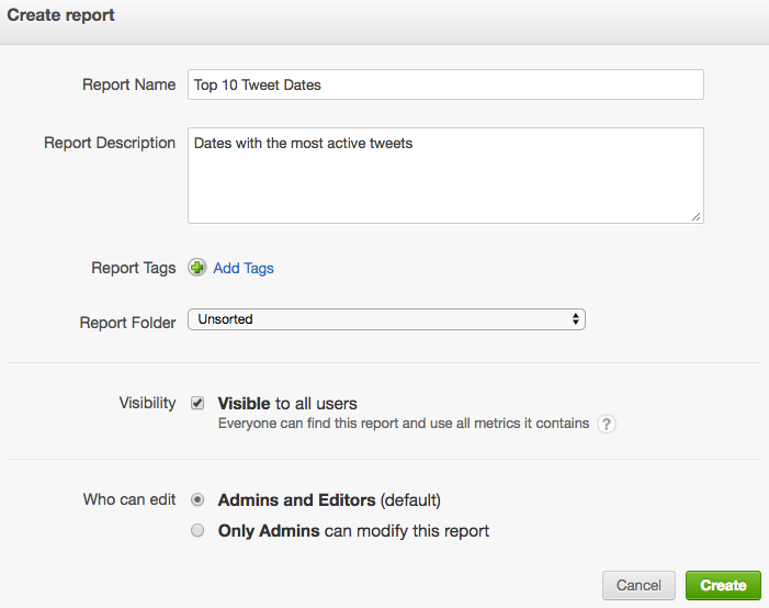
Click Create. The dialog closes. The report is saved and appears in the list of reports on the Reports page. The report is now available for all users of the project. The users can add it to any number of project dashboards.