Creating a Dashboard
This topic is part of the tutorial that is intended for developers who plan to work on data models and ETL using CloudConnect.
If you are interested in creating reports, dashboards, or metrics, start with [Reporting and Dashboards]{.ul}.
CloudConnect is a legacy tool and will be discontinued. We recommend that to prepare your data you use the GoodData data pipeline as described in Data Preparation and Distribution. For data modeling, see Data Modeling in GoodData to learn how to work with Logical Data Modeler.
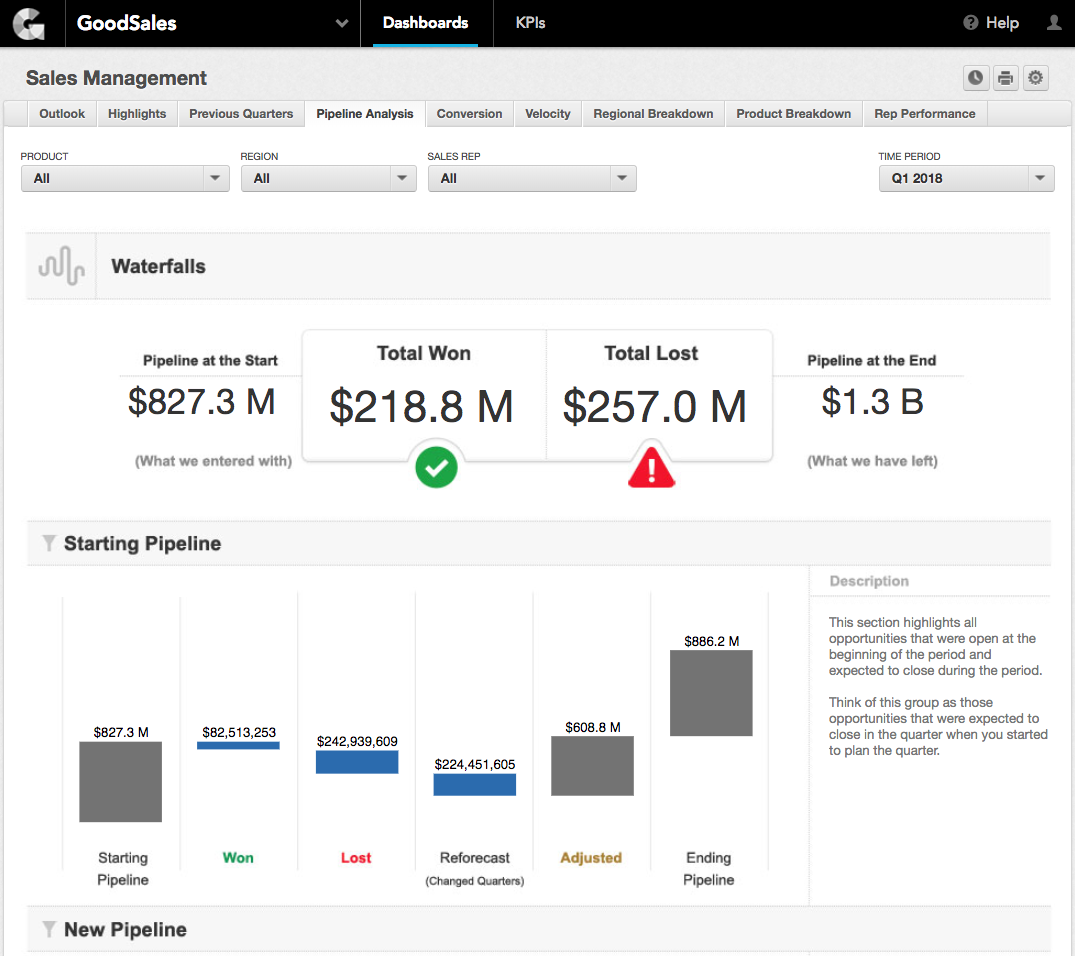
GoodData offers business users actionable insights that they can use to make critical business decisions. These users will be best equipped if provided an array of reports arranged to give them the context they need to understand the health of their business. This is where the GoodData dashboard comes in. Dashboards are composed of a series of tabs that can be used as canvasses to display critical data. Together, these tabs tell a story about a key business process, such as lead generation or sales management.
Dashboards can contain reports, widgets, dashboard filters, text, and web content.
In this section, you are going to add the report that you have created earlier to a dashboard tab. You are also going to add additional dashboard elements, such as widgets, filters, text, and embedded web content to your dashboards.
Building Dashboards and Tabs
Steps:
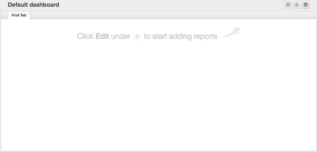
Log in to the GoodData Portal. The Dashboards page opens. The Dashboards page displays all dashboards and dashboard tabs in the project, if any exist. Because you have not created any dashboard yet, the screen is empty.
To get started, click the gear menu icon
 in the top-right part of the page.
- To add your report to a new dashboard, click Add Dashboard.
- To add the report to the current dashboard, click Edit.
You are now in dashboard edit mode. Try carrying out the following procedures to practice editing your dashboard:
- To add a new tab, click the plus (+) icon to the right of the current tabs.
- To modify existing tabs, click the down arrow next to the tab name and make a selection.
- To rename a dashboard, click the dashboard name above the list of tabs.
Adding Reports, Widgets, Text, and Web Content
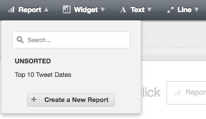
In edit mode, you can add objects to the current dashboard tab. Select the object through the drop-down menus at the top of the page.

Steps:
- Add the report you created to the dashboard. Click the Report menu, and select the title of the report you have created. Notice how you can also select Create a New Report in this menu to navigate to the Report Editor.
- Reposition the report on the active dashboard tab. To resize the report, select the report and then drag the corner handles that appear along its perimeter.
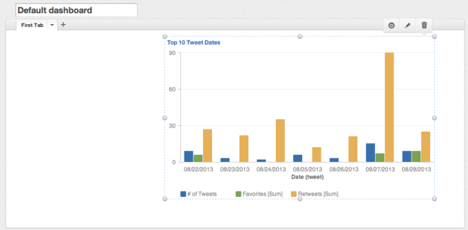
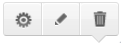
Select your report, and notice the additional icons that appear. These icons allow you to carry out additional report configurations, edit your report’s fundamental configurations in the Report Editor, or delete your report from the current tab.
Experiment by adding additional objects to your dashboard using the remaining menus along the top of your page:
- Widget: Add headline widgets that display a single metric value (see Creating a Headline Report) or Geo chart widgets that display data across actual geographic regions (for projects with geo data - see Building a Geo Chart and Setting up Data for Geo Charts).
- Text: Add text blocks as headlines, sub-headlines, descriptions, or to indicate the value of a variable assigned to the user viewing your dashboard.
- Line: Add horizontal or vertical lines to divide sections of your dashboard.
- Web Content: Embed graphics, stylized text, icons, shapes, images, videos, or entire web pages (see Dashboard Design Lab).
- Filter: Add filters that allow users to limit the data that goes into computing all of a dashboard tab’s reports by attribute value or time range (see Dashboard Filters).
Summary
You have made it all the way from setting up a GoodData project to designing dashboards that business users can use to glean valuable insights.
For more information on how to design effective dashboards for business users, we recommend the following topics: