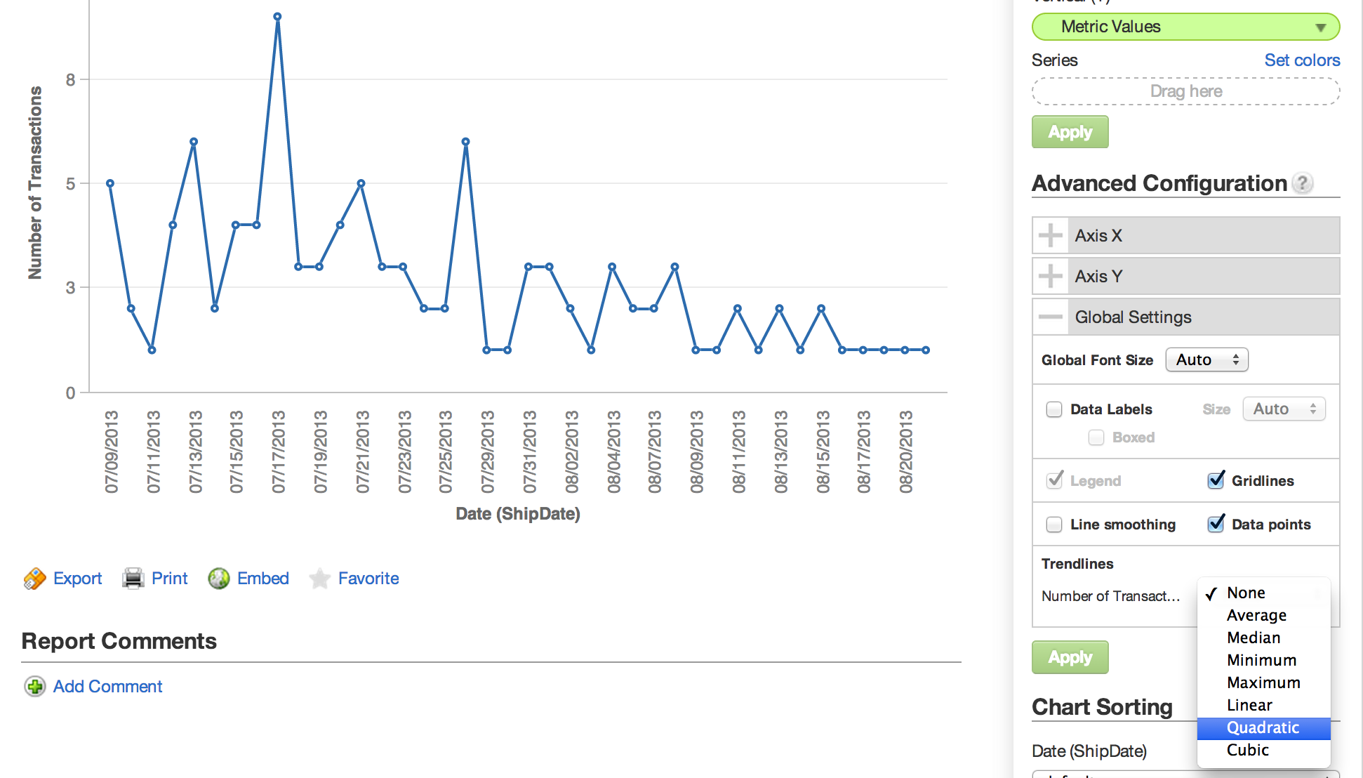
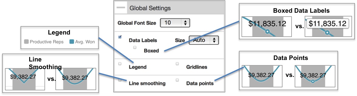
Global Settings
In the Advanced Configurations pane of the Report Editor, the Global Settings enable configuration of display options such as text font size and additional labeling options for the selected report.
The options available under Global Settings may vary depending on the type of chart at hand. Global settings are not available for headline reports.
Trendlines
Trendlines are available only for line charts. If you switch the chart to another type and then switch it back to a line chart, the trendline is not remembered. In Internet Explorer 9 and 10, trendlines appear as solid lines.
For each data series in a chart, you can configure a trendline to appear with the data on the chart. Also known as a line of best fit, a trendline seeks to identify general trends in data such that there are an equal number of data points above and below the line in the chart.
Trendlines appear as dashed lines in the same color as the data series line in the chart.
A trendline can be misleading. The displayed line does not factor the correlation between the two represented types of values in the chart. For example, perfectly correlated datasets can have the same trendline as much more scattered datasets, even though the predictive ability of the perfectly correlated datasets is much higher.
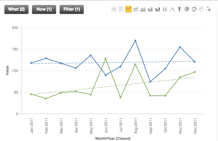
Trendlines can be defined to identify the following types of trends in Y-axis data: Linear, Maximum, Minimum, Average, Median, Quadratic, and Cubic.
- Linear seeks to identify trends in values based on a linear regression line.
- Quadratic trendlines are the plots of quadratic equations (Ax^2^ + Bx + C) that describe the path of minimum variance through a set of data points. These trendlines are useful for describing trends in data when there is a single peak or valley.
- Cubic trendlines rely on cubic equations (Ax^3^ + Bx^2^ + Cx + D) to describe the path of minimum variance through a set of data points. They are useful for describing data trends that contain multiple peaks and valleys.
- For more information on linear regression and other statistical capabilities, see MAQL and Multidimensionality.
To configure a trendline, expand the Global Settings under Advanced Configuration in the Report Editor. Next to the data series of interest, select the type of trendline you wish to apply to the series.
Click Apply.