Configure a Chart
To alter the way chart elements are displayed, drag elements beneath a new heading. For example, you may display metric values along a different axis.
Use the Series heading when you’d like to display a number of metric values in parallel, either as separate bars, lines, bubbles, etc., depending on the chart type.

At the top of the Configuration pane, the Configuration sub-pane determines how the metrics and attributes of your report will be displayed.

Each metric and attribute defined in a given report is displayed as a drag-and-drop component:

Report components can be dragged under different headings within the Configuration sub-pane to alter the way they are displayed on a chart:
- Horizontal (X): represents the report component(s) that will be displayed horizontally along the x-axis.
- Vertical (Y): represents the report component(s) that will be displayed vertically along the y-axis.
- Series: determines how multiple metrics will be displayed within the same chart (e.g. a line chart with multiple lines, a pie chart with multiple slices, a bar chart with two bars for each value of an attribute).
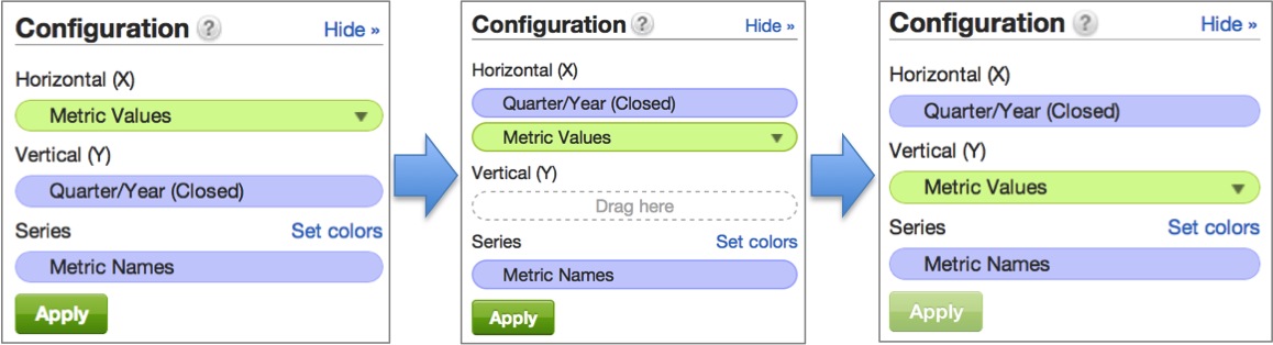
For example, from the Configuration sub-pane visual above we know that the attribute Quarter/Year (Closed) is currently displayed vertically along the y-axis. But I’d prefer to display my time attribute across the horizontal x-axis of my line chart.
To change the orientation of the chart, drag the Quarter/Year (Closed) component under the Horizontal (X) heading. Then drag the Metric Values component under the Vertical (Y) heading: