Waterfall Chart in Report Editor
Waterfall charts show the net change in some amount between a starting point and end point. The net change is typically displayed as though broken down into constituent parts.
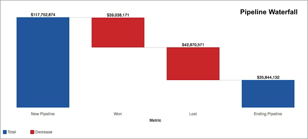
For example, the waterfall chart below displays the net change in a sales pipeline during a given quarter. The first bar represents the starting point (total opportunity amount at the start of the quarter), while last bar represents the end point (total opportunity amount left at the end of the quarter).
Together, the two central bars in red represent the difference between the start point and end point.
Unlike a typical bar chart, this waterfall chart actually displays four metrics, rather than a single metric broken down by one or more attributes.
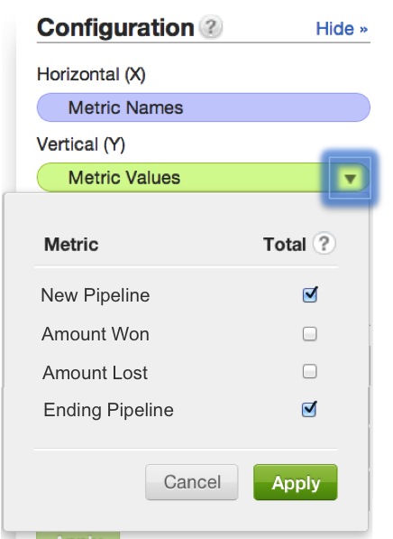
Waterfall charts may require some extra steps to set up. To establish the bars designating the start and end points, use the dropdown options associated with your chart’s Metric Values in the Configuration pane. Select the checkbox under Total for the start and end points of your waterfall:
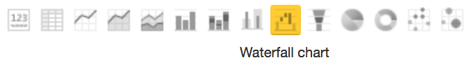
To display a report as a waterfall chart, from the Report Editor, select Waterfall Chart from the list of chart icons:
For details about the report editor, see Creating New Reports in the Report Editor.