You are viewing our older product's guide. Click here for the documentation of GoodData Cloud, our latest and most advanced product.
Scatter Chart in Report Editor
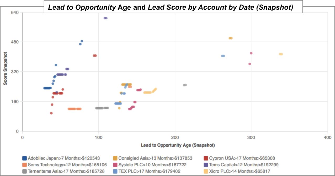
Scatter charts are useful for analyzing trends between two metrics or for tracking the magnitude of two metrics from the same chart. Scatter plots typically have a minimum of two metrics, one for each axis, and one attribute,which determines the meaning of each data point.
The following scatter chart displays the relationship between two metrics: the age of individual account opportunities (x-axis) and the account opportunity’s score (y-axis).
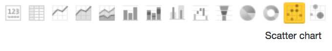
To display a report as a scatter chart, from the Report Editor, select Scatter Chart from the list of chart icons:
For details about the report editor, see Creating New Reports in the Report Editor.