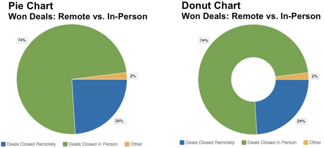
Pie and Donut Charts in Report Editor
Pie Chart in Report Editor and Donut Chart in Report Editor are functionally similar charts for showing parts of a whole. The following charts display the same information:
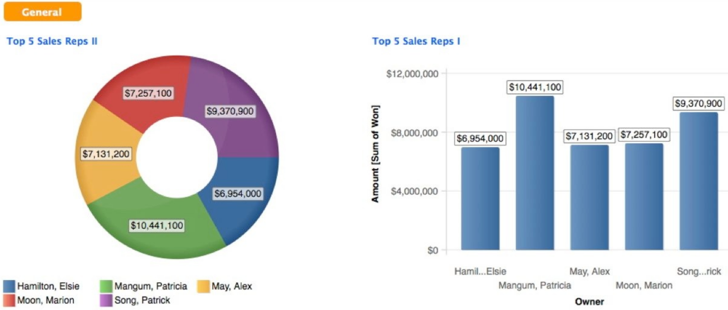
The chart below shows identical data in two reports. In this case, the bar chart best facilitates comparisons of sales rep performance.
If it is important to accurately compare components of the chart, use a Bar Chart in Report Editor. The relative size of pie and donut slices can be hard to visually compare.
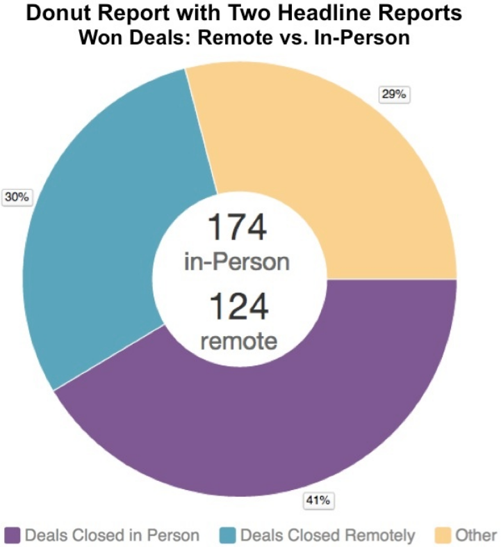
If you use percentage in a pie chart or a donut chart, the report values that are too small (for example, less than 0.5%) may get rounded down to 0%, and therefore the chart may display them as 0%. To avoid this, try the following:
- If acceptable, switch from percentages to absolute numbers (from the Report Editor, click << Show Configuration, then navigate to Advanced Configuration -> Global Settings -> Data Labels, and un-select As %.
- If you have to keep percentages, use a metric that already calculate percentages rather than absolute numbers (see Metric Wizards and Custom Metric Editor in What Pane - Adding Metrics to Reports). For example, use
SELECT FactA / SELECT FactA BY AttributeCrather thanSELECT SUM(FactA). Then, format the percentage values to show the numbers after the decimal place (see Round to a Specified Number of Decimal Places in Formatting Numbers in Insights and Reports).
The following example shows two headline reports, each displaying the absolute value of one of the donut chart’s metrics:
SaveSave