Combo Chart in Report Editor
Combo (custom) charts combine any two of the following chart types: bar chart, line chart, or area chart. Each chart can be assigned to its own axis to display metrics of different units and scales, contained within the same chart. Starting with an individual chart type, you create a combo chart by assigning different visualization styles to metrics in the chart.
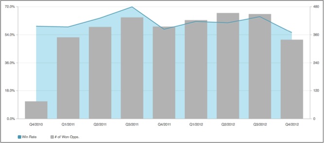
A combo chart does not have a visualization icon in the Report Editor until after two metrics in the displayed chart have been given different visualization styles in the configuration pane.
Here is a video tutorial on creating a combo chart:
TIP: Display Multiple Metrics as a Combo Chart
In a combo chart, you can have only two metrics. If you need to have more than two metrics, you can create two reports (for example, bar chart and line chart) and place them on your dashboard overlaying one another so that it looks like it is a combo chart.
For example, you have five shops. For each shop, you want to display the online sales amount (Metric 1) and the offline sales amount (Metric 2), and compare these two amounts to the average sales amount (Metric 3).
In this example, we are going to use a bar chart and a line chart as reports simulating a combo chart. However, you can combine any two of the following chart types: bar chart, line chart, or area chart.
Steps:
- Create a bar chart with Metric 1 and Metric 2.
- Create a line chart with Metric 3.
- In the line chart, remove the gridlines and the legend, hide the metric and attribute names. For more information, see Global Settings.
- Add both the bar chart and line chart to your dashboard. Move the reports around so that they overlay on top of each other on the dashboard.
- Click the line chart, and click the Gear icon to open the report’s configuration.
- Click Arrange, and drag the slider to the right to send the line chart forward in relation to the bar chart. Click Apply. The line chart moves to front.
- Click Save to save the dashboard.