Bullet Chart in Report Editor
The bullet chart is useful for displaying a single key measure compared to a static target, such as a maximum or a quota.
Bullet charts come in various forms. In the following example, a bullet chart is coupled with a headline report on a sales dashboard. The headline report displays the total number of marketing qualified leads (MQL) on top. Beneath the headline, a bullet chart indicates the percent of MQLs achieved this quarter (represented by the skinny blue bar) with respect to the original goal (represented by the wider gray bar).

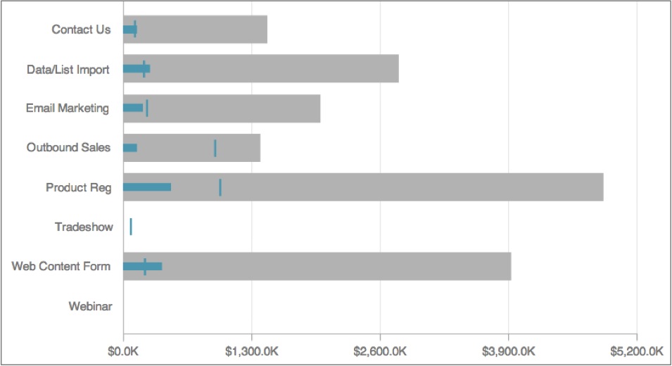
Bullet charts can be more complex. In the following example, the thick gray solid bars represent predictions. The small turquoise vertical markers in the bars represent goals, and the skinny turquoise horizontal bars represent actual progress toward those goals:
In the Configuration pane for bullet charts, each option’s drop-down contains a list of all metrics that appear in the bullet chart report.
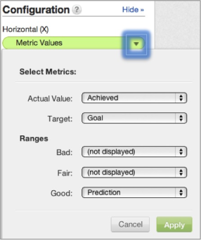
Some additional guidelines:
- A metric can only be selected on one of the options dropdowns for the report to be valid.
- The metric set to Actual Value is displayed as the skinny bar. Colors are customizable and may vary.
- The metric set to Target is displayed as the small vertical marker.
- The metrics set to the Bad, Fair, or Good ranges are displayed as thicker bars. A different color can be applied to each range.
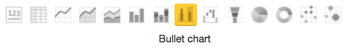
To display a report as a bullet chart, from the Report Editor, select Bullet Chart from the list of chart icons:
For details about the report editor, see Creating New Reports in the Report Editor.