You are viewing our older product's guide. Click here for the documentation of GoodData Cloud, our latest and most advanced product.
Bubble Chart in Report Editor
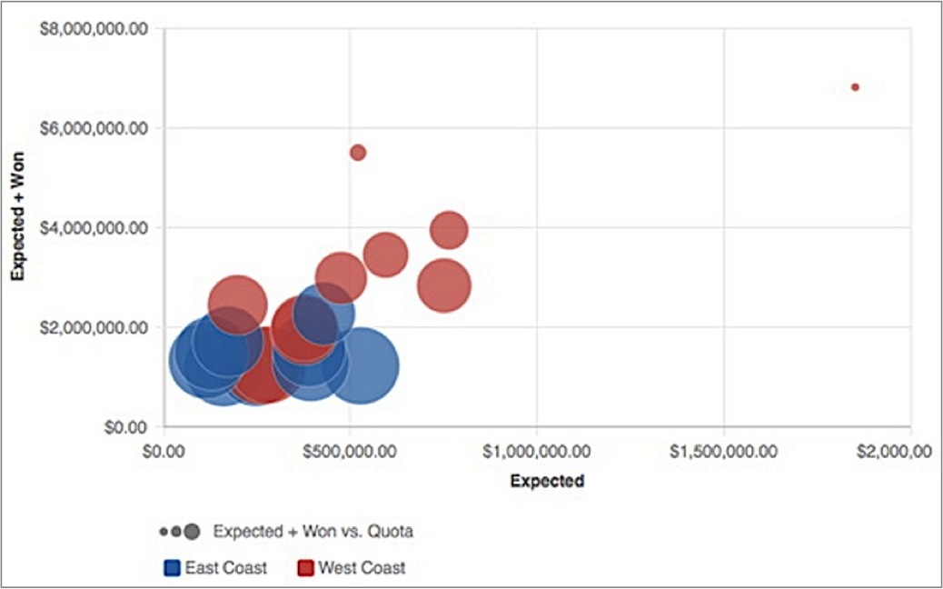
Similar to scatter plots, bubble charts offer added functionality: the size of the plotted points can be set to change in proportion to the magnitude of a third metric.
In the following chart, the position of a bubble along the x-axis indicates one metric value, while its position up the y-axis indicates a second metric value. The bubble’s size indicates a third metric: the relationship of the Expected + Won value to the quota, which is indicated by the size of each bubble.
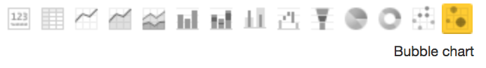
To display a report as a bubble chart, from the Report Editor, select Bubble Chart from the list of chart icons:
For details about the report editor, see Creating New Reports in the Report Editor.