Area Chart in Report Editor
Like line charts, area charts can be used for expressing changes in a metric across time. Unlike line charts, area charts shade the area beneath the lines that represent metric values, so you can easily compare volumes of data.
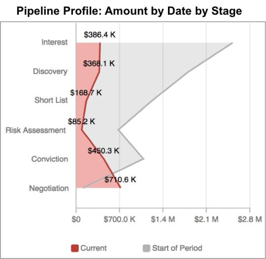
The following area chart displays the total amount of money associated with deals in each stage of a sales pipeline: at the current time and at the start of the period. The shaded area to the left of the lines helps to highlight the sideways orientation of the chart. While Stage isn’t technically a time attribute, an area chart is appropriate here because a pipeline represents a linear progression of deals across stages until closure.
To display a report as an area chart, from the Report Editor, select Area Chart from the list of chart icons: