Chart Types
The various chart types in the GoodData Portal are each useful for displaying different types of data in order to gather unique types of insights. The bar chart is designed to ease comparisons between discrete categories of data, scatter charts allow users to gauge correlations between two metrics, and the bullet chart is best suited for indicating progress toward an objective. With many other chart types to choose from, you have some decisions to make. The following sections introduce the available chart types, provide typical examples of each chart, and drop pointers on how each chart may be used to help dashboard viewers draw meaningful conclusions from your data.
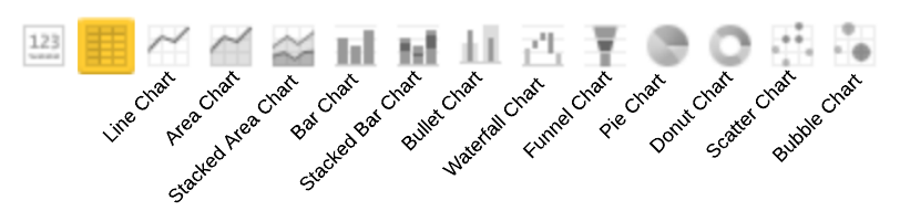
To display a report as a chart, from the Report Editor, select from the list of chart icons:
Whatever the chart you choose, your decision needn’t be final. You can view the same data visualized in different ways by selecting various chart types in turn. Each time you click a new chart icon, your report will automatically refresh to display your data in the form of the chart you have selected.
The following chart types are available in GoodData:
- Area Chart in Report Editor
- Bar Chart in Report Editor
- Bubble Chart in Report Editor
- Bullet Chart in Report Editor
- Combo Chart in Report Editor
- Donut Chart in Report Editor
- Funnel Chart in Report Editor
- Line Chart in Report Editor
- Pie Chart in Report Editor
- Scatter Chart in Report Editor
- Stacked Area Chart in Report Editor
- Stacked Bar Chart in Report Editor
- Waterfall Chart in Report Editor