Advanced Chart Configuration
In the Advanced Configuration sub-pane, you can modify settings that apply to the X-axis, to the Y-axis, or to the entire report.
Click the plus icon to see the available settings.
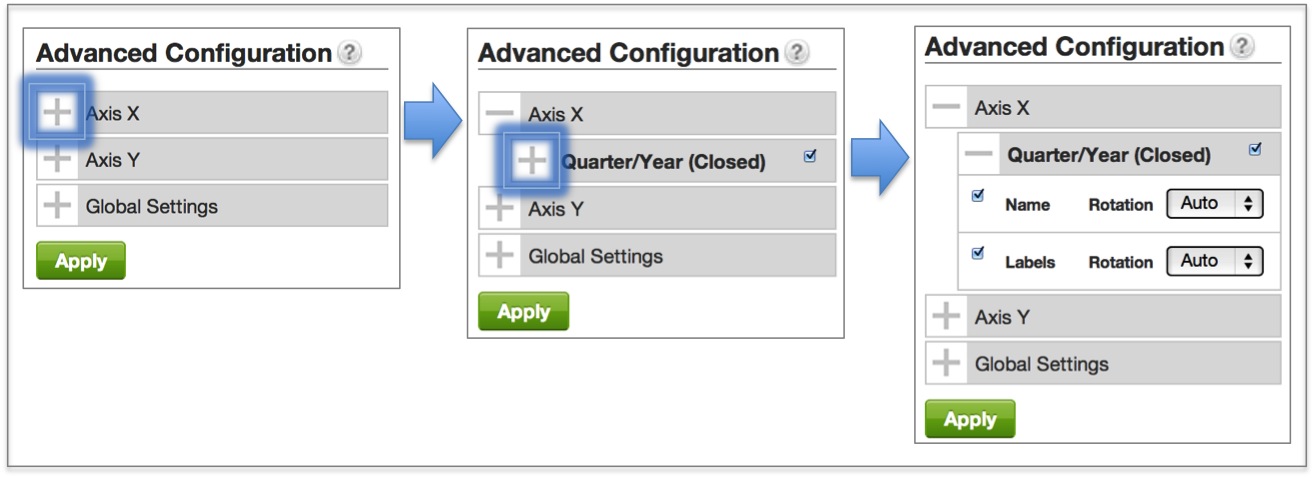
Configuration options differ for axes associated with attributes versus axes associated with metrics. See also Global Settings.
Display Metric Values along a Chart Axis
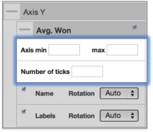
Axes that are associated with a metric offer several additional options, such as Axis min and max, and Number of ticks.
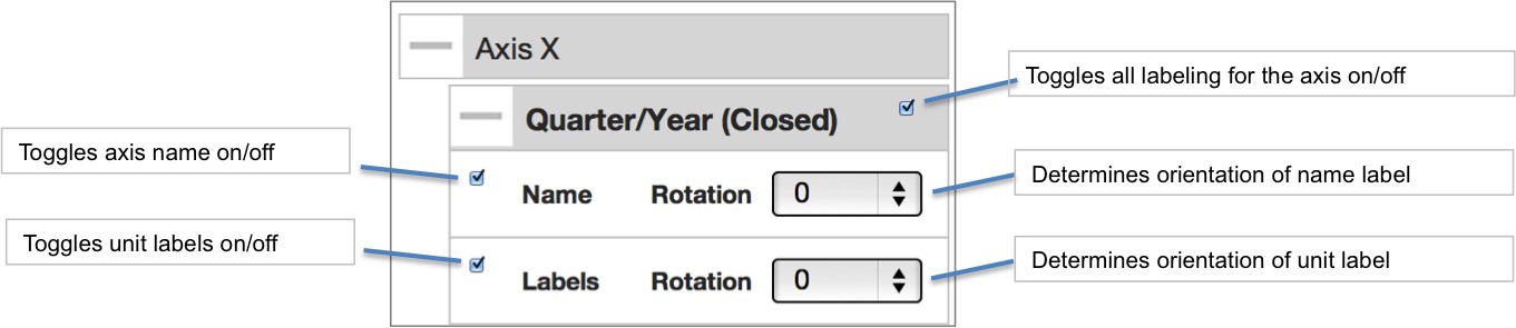
The label assigned to a chart’s axis is inherited from the tabular view of that chart’s data. To change an axis' label, toggle to a tabular view by clicking the Table visualization icon. Double click a column header to edit its contents. Press the enter (return) key to finalize your new header name. When you’re ready, return to the chart visualization of your choice. Notice how the axis label has changed to conform to the new name of the associated column header.
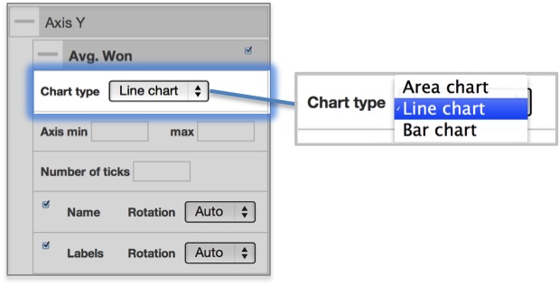
Chart Type Dropdown
In the case where two or more metrics have been added to the report an additional dropdown appears: Chart type. Chart type is useful for displaying multiple metrics on the same chart in different ways. When multiple chart types are combined within the same chart, we call this a Combo or Custom chart.
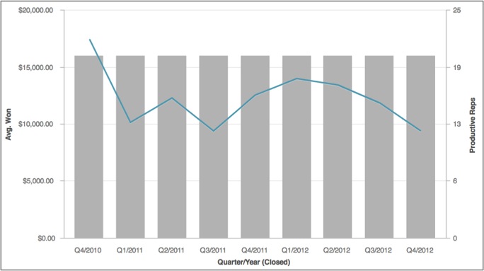
In the example below, the chart displays both metrics along the y-axis but Avg. Won metric is presented as a line chart while the Productive Reps metric is presented as a bar chart.
No matter the original chart type (Bar, Line, or other), once a report editor has opted to present report metrics as different chart types from the Advanced Configuration sub-pane, the report’s chart type will automatically change to Custom. Note how this is reflected with the appearance of a new icon in the upper right corner of the page.

Display Attribute Values along a Chart Axis
Axes that are associated with an attribute have axis-labeling options only.