Compare Data from Multiple Time Periods in a Report
This tutorial describes how to create this combo chart, in which data from multiple years is displayed in the same report.
This intermediate tutorial assumes some knowledge of MAQL. For more information, see MAQL - Analytical Query Language.
Contents:
The following example report compares the number of tickets created and solved between years 2010 and 2011 for a support organization.
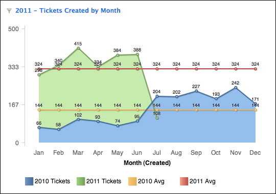
This combo chart contains the following information:
- Ticket volume by month
- Direct comparisons between this year and the previous one.
- Average ticket volume for comparison
This report uses four custom metrics and some more advance visualization techniques.
Metrics
The following metrics are defined in the Custom Metric Editor.
Metric # | Metric Name | MAQL Formula |
|---|---|---|
1 | Created Tickets - Last Year | |
2 | Created Tickets - This Year | |
3 | Average Tickets Created - Last Year | |
4 | Created Tickets - This Year | |
Reading the Metrics
PREVIOUS and THIS
The first two metrics are fairly easy to understand, the only difference being the use of the PREVIOUS and THIS keywords. Along with NEXT, these keywords enable you to build metrics that reference floating time periods based on the value inherited from the referenced attribute, the Year(Created) attribute in this case.
So, the first metric gathers the total number of tickets from the previous year and the second gathers the number from the current year.
Metric 3 - Average Tickets Create - Last Year
SELECT (SELECT # Tickets BY ALL IN ALL OTHER DIMENSIONS WHERE Year(Created) = PREVIOUS WITHOUT PF) / 12
Although the syntax looks significantly different, this metric is similar to Metric 1. The inner SELECT statement uses two keywords in order to total the number of tickets from the previous year, before dividing the total by 12 to calculate the monthly average. The two keywords are described below.
- BY ALL IN ALL OTHER DIMENSIONS: This keyword means that regardless of the attributes used to slice your report, the metric returns the total number for # Tickets. In this case, the maximum value for the metric is always returned, no matter how the report is sliced.
- WITHOUT PF: This keyword, which can also be referenced as WITHOUT PARENT FILTER, means that no report filters should be applied to this metric, ensuring that the total number of # Tickets is applied to the calculation.
In the numerator of Metric 3, the total number of tickets is calculated for the previous year, with keywords applied to prevent the application of any filtration on this total. The denominator then divides this number by 12 to produce a static metric for monthly average of tickets last year, regardless of how it is sliced in a report.
Metric 4 - Average Tickets Created - This Year
SELECT (SELECT # Tickets BY ALL IN ALL OTHER DIMENSIONS WHERE Year(Created) = THIS WITHOUT PF) / (SELECT COUNT(Month(Created),Ticket Id) BY ALL OTHER WHERE Year(Created)=THIS WITHOUT PF)
Very similar to Metric 3, Metric 4 needs to calculate the average monthly tickets by factoring only the months that have occurred so far in the current year. Dividing the total number of tickets (numerator) for the year by 12 would yield an inaccurate number if, for example, the current month is June. In this case, the denominator must factor the number of months that have occurred in the current year:
code:(SELECT COUNT(Month(Created),Ticket Id) BY ALL OTHER WHERE Year(Created)=THIS WITHOUT PF)
- SELECT COUNT(Month (Created), Ticket Id): This part of the denominator performs a simple count of the possible month values based on the ticket identifiers. For the COUNT metric, the first parameter identifies the attribute for which to count unique values present in the data(Month (Created)), while the second parameter identifies where to perform the count (Ticket Id dataset). In effect, this part of the denominator counts all possible month values for the unique ticket identifiers. Note, however, that this data is later filtered by the WHERE clause (WHERE Year(Created)=THIS), which yields only the count of month identifiers for the current year. Since data for months in the future has not been generated, the data in the report is limited to the present month and the prior months of the same year.
- BY ALL OTHER: Shorthand for BY ALL IN ALL OTHER DIMENSIONS, this keyword indicates that the count of month names should be made without regard to any slicing and dicing applied to the report.
- WITHOUT PF: This keyword causes any report-level filters to be ignored in the calculation of this part of the metric. When combined with BY ALL OTHER, the denominator generates a constant value for the current year.
Defining the Report
Now that you have defined the metrics, you can add them to a new report:
Type | Items to Include |
|---|---|
Metrics (What pane) | Created Tickets - Last Year, Created Tickets - This Year, Average Tickets Created - Last Year, Average Tickets Created - This Year |
Attributes (How pane) | Month (Created) |
Filters (Filter pane) | Month (Created) isn't "(empty value)" |
The filter is required. GoodData’s date hierarchy includes all month (Jan-Dec) plus an “empty value” month for cases when no date appears. Adding this filter is a good practice to avoid adding an extra entry in your report for these empty values.
Configuring the Combo Chart
After you have saved the report, you must visualize it as a combo chart. A combo chart uses multiple visualizations in a single chart. In this case, the actual number of tickets is defined as an Area Chart, while a Line Chart is used for the averages.
Steps:
Open the Configuration pane. Set the following values:
- Horizontal (X): Month (Created)
- Vertical (Y): Metric Values
- Color: Metric Names
Click the drop-down next to Metric Values. For each metric, select the following axis:
Metric Name
Axis
Created Tickets - Last Year
Primary
Created Tickets - This Year
Primary
Average Tickets Created - Last Year
Secondary
Average Tickets Created - This Year
Secondary
After defining the axis for each metric, you can apply a different chart type to each access, which enables you to mix chart types in a single chart. In the Advanced Configuration pane, expand the Y axis panel.
- For the Primary Axis chart type, select Area chart.
- For the Secondary Axis chart type, select Line chart.
- Set the Max value for each axis to be the same value. By forcing the charts to share the same scale, you make it easier for your users to read the data.
Your combo chart is created.