You are viewing our older product's guide. Click here for the documentation of GoodData Cloud, our latest and most advanced product.
Numbers and Arrows in Dashboards
This article shows tips and tricks how to develop large number visuals and progress indicators such as numbers and arrows in your dashboards.

Large Font Numeric Report
- Create a report showing a single number. Do not add any attributes in the How section.
- Convert the report to a stack bar chart.
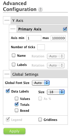
- Go to Advanced Configuration → Y Axis → Primary Axis.
- Set the max of the axis to a large number, for example 1000000000
- Unselect the Name and Labels checkboxes
- In Advanced Configuration → Global Settings, select Data Labels.
- Set the font size to 18.
- Select Totals.
- Unselect Values and Boxed.
Trending Colored Arrows:
To show a positive/negative trend, create a second metric showing a difference in time.
For example, the Revenue metric showing the trend between the last month and the month before it (attribute Month):
SELECT (SELECT Revenue WHERE Month/Year = PREVIOUS )
- (SELECT Revenue WHERE Month/Year = PREVIOUS-1)
This is an Advanced Custom Metric (see Get Started with Using MAQL to Write Metrics).
To create a customized formatting for this metric, use both conditional formatting (different for negative and positive numbers) and change the font color:
[green]▲;[red]▼
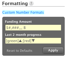
You can use a Unicode symbol for up/down arrows or your own symbols/arrows, for example, by copy/pasting them from Wikipedia (shapes, arrows).