Taking Dashboard Effectiveness to the Next Level
If you are a first-time user and you start to create your own dashboards, you may not get the most out of GoodData. If you ask what numbers someone would like to see, are you getting suggestions that are usable or actionable? Knowing your total sales in a month is certainly good to know, but what are you planning to do with that? What actions can you take and how is your business going to get better?
Let us look at the following demo dashboard where a retail customer is managing their chain of stores:
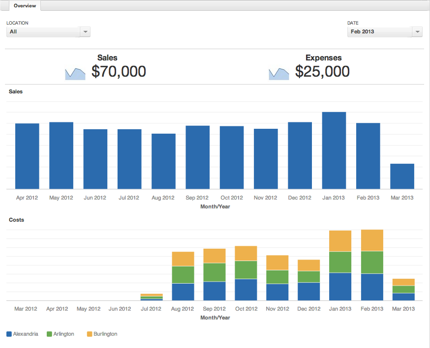
The dashboard looks nice and has plenty of information, but lacks effectiveness. In the following section, you will learn how to extract more from the dashboards.
Percentage Comparisons
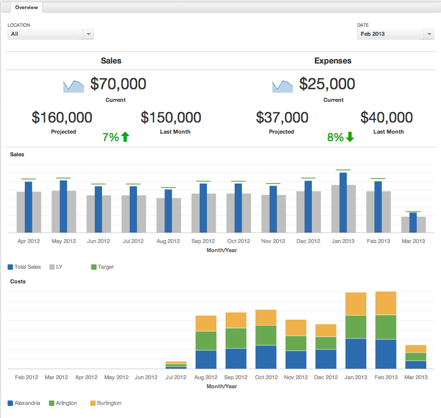
In the top of the example, you see two basic headline reports showing monthly sales and costs. However, you cannot tell if the numbers are good or bad. To change that, add a new widget to the dashboard to show the total from the previous month or a rolling 6 month average to set a baseline (you can also set a goal). Next, if you are conducting a Month-to-Month comparison, you need to know where you are projected to be at. Here is the metric that takes your amount and estimates the end of month value:
select ( sum(sales) / count(dates) ) * (count of days in month)
Finally, you can make a percentile change comparing your baseline to projected amounts. The formula for percentile change is listed below:
select (this-last)/last
We can use conditional formatting to give a bit more usefulness to it, and have <0% colored red, 0-3% yellow, and 3%+ green.

Year over Year
Below the headline reports in the example above, you see the progress of monthly sales. Again, it is hard to judge the significance of the figures but you can add historical context and growth. Bullet charts can help you visualize that context. You can create a metric that shows the previous year’s value:
select sum(sales) where year = {this}-1
Next, you can create another metric to provide a reference as to where your business should be heading. In this example, set it as 5% growth compared to the last year. The metric looks like this:
select sum(sales) *1.05 where year = {this}-1.
In the Configuration menu, set the Metric values as a range and target mark. Now you have a far better idea if you are meeting your goals. If you are in a situation where amounts or sales constantly increase year over year, you can use all three of the Bad, Fair, and Good options to track performance three years back.
Drill Downs
Finally, at the bottom of the original example, you see a stacked bar chart showing costs by location. Looking at a goal, you see that the month of January was over budget so you want to dig dig in and see why costs were so high. There are two ways to set drilldowns in GoodData. The first way to process is on the attribute level.
In this first example, you set the default drill paths, such as
Quarter->Month->Week or Department->Group->Manager
These drill paths will be automatically enabled whenever that attribute is used.
The second way is to create the drill-across reports. You can define specific reports to be linked to a dashboard using the edit dashboard mode. In this example, you want to create a report that shows the employee name, manager, hourly rate, date, hours work, and total cost. Now you can see the details and know who to follow up with about abnormalities.
All of these ideas come from trying to find the root cause.
Using the dashboard effectively will provide you with a much better idea where to focus your time and effort. When presented with any sort of disconnect, keep asking why until you find yourself at an actionable item.