Dashboard Design Tips
At GoodData, we’ve helped hundreds of organizations create effective business dashboards. The way we see it, dashboard design is more than just heaping your most critical business metrics onto a single screen. By implementing a few simple design principles, you’ll be well on your way to transforming how your dashboard viewers put their data to work.
1 - Keep it Simple
If the dashboard designer’s ultimate goal is to offer business users information that can be readily consumed, consideration of the audience’s needs is key. That calls for cutting out any clutter that impedes users from understanding the key information. It also means leaving some empty space on your dashboard:
White space helps users concentrate on what matters.
Sometimes, white space and thoughtful grouping of objects are enough to indicate the relationship between dashboard objects. Otherwise, simple unobtrusive lines, shapes, and headers can add valuable structure to a dashboard without interfering with the user experience.
2 - Stay Focused
The best dashboards serve a specific purpose. The best designs often define the area of focus upfront and then stick to it.
During the planning process, utilize wireframing to assist the team in focusing on the most important content. Slick wireframing software can make your outlines especially attractive, but we’ve found that putting pencil to paper or marker to whiteboard is just as effective.
During planning, refine your ideas on the key reports and metrics used to build the rest of the dashboard. Stumbling blocks at this juncture often serve to highlight additional requirements to incorporate into the design.
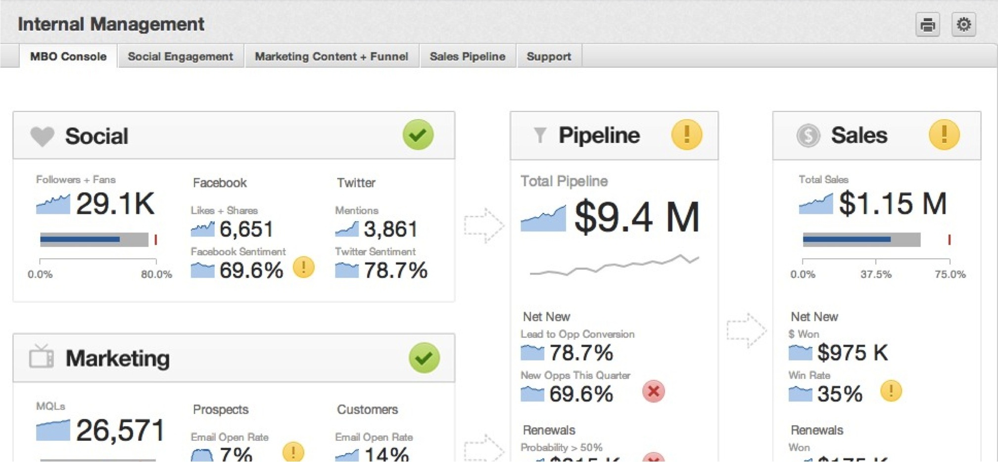
3 - Tell a Story with Tabs
The tabs on each dashboard are useful tools for strategically segmenting content.
- A “deep” dashboard demands excessive user scrolling, as your users must scroll and scroll through a sea of reports and few tools to parse the information.
- A “shallow” dashboard tab extending little further than the fold may inspire a sense of surfing across a dashboard.
Limit your tabs to two sub-topics. Place groups of reports on separate tabs if they are liable to be filtered by different date dimensions. Too many date dashboard filters on the same tab can be confusing.
When designing your tabs, you should consider how they are arranged to satisfy the logical flow of questions that your users will be seeking to answer. Well-organized dashboard tabs put power in the hands of the users, who can then navigate through data at their own pace while following the structure you’ve created.
Do you have groups of tabs that seem to be telling two or more distinct stories about your business? Consider splitting your dashboard in separate dashboards that focus on one business process or user group at a time.

4 - Choose Your Visualizations Wisely
Here are a few best practices for choosing the chart type to relay information to your users.
For more information, see Chart Types.
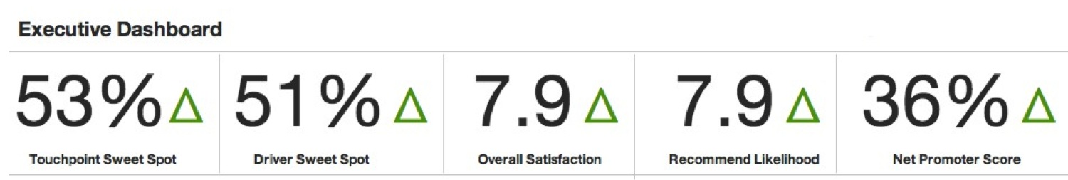
Headline Reports
Headline reports do best at the top of a dashboard tab where they can provide a broad overview of performance. More complex reporting can be introduced further down the dashboard tab.
Pie Charts
Avoid using pie charts when accuracy in value comparison is critical. Without labels they’re apt to distort the truth! While pie charts are naturally suited for showing parts of a whole, you can also express this notion with a bar chart with labeling indicating that all values sum to 100%.
Scatter Charts
Scatter charts are great for seeking out correlations between two metrics.
To introduce a third metric (represented by the size of each data point), switch to a bubble chart.
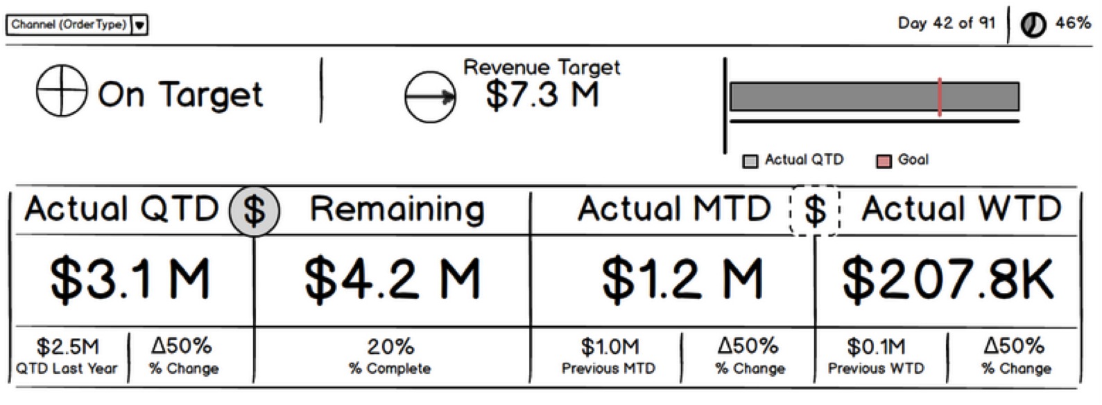
Bullet Charts
“Speedometer” or “thermometer” visualizations have long been used to indicate current status with respect to a quota, but we prefer the linear simplicity of a bullet chart.
Heat Maps
Add some conditional formatting rules, and tables can make great heat maps!
Avoid the urge to create “master report” spreadsheets, where information suitable for multiple reports is crammed into a single table. When possible, summarize this information in a series of charts to make it more accessible to users.
5 - Integrate Your Brand (Embed Web Content)
Whether you’re designing dashboards as customer-facing offerings or as part of an internal analytics solution, integrating your brand into dashboards helps create a seamless user experience. Users have grown accustomed to aesthetically appealing websites, apps, and software, and they have every right to expect the same of their dashboards.
A little polish is even preferred to unrestrained customizations that draw attention from what matters most: business data that empowers end users.
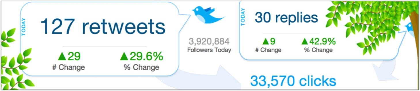
- With the Web Content widget (see Build a Dashboard) and the Custom Embed Tool, you can add logos, icons, and custom text styles to your dashboards, as well as graphics, videos, or entire web pages. You can even embed live feeds (news, Yammer, Twitter, etc.) or third-party widgets.
- In the Design Lab, you can find a library of boxes, tables, icons, and headers that can really make a dashboard stand out. For more information, see Dashboard Layout Assets).
You’re on your Way!
With time constraints and many stakeholders to please, it’s all too easy to revert to creating dashboards that try to do everything yet master nothing. With some planning, reporting best practices, styling, and a clear focus on helping your users reach their objectives, anyone can create an outstanding dashboard that is widely used.