Build a Dashboard
A workspace in the GoodData Portal contains one or more dashboards, which in turn are segmented into dashboard tabs. You can begin building dashboards and dashboard tabs by entering Edit Mode and using the dashboard element menus to add reports, widgets, text, lines, embedded web content, and dashboard filters.
A workspace is organized into dashboards, dashboard tabs, reports, and the metrics that are contained within those reports. At the lowest level, facts, attributes, and source data represent the foundational components that are aggregated to form the metrics displayed in dashboard reports.
Workspaces > Dashboards > Tabs > Reports > Metrics > Facts & Attributes > Data
In this tutorial, you explore how the various objects that you can create in a workspace are integrated into reports, which are added to dashboard tabs, which are components of a dashboard.
Each tab on a dashboard is like a canvas that can be designed to express critical data to business users. By the end of this tutorial, you will be able to add a new dashboard to a workspace and customize dashboard tabs by adding reports, widgets, text boxes, lines, embedded web content, and dashboard filters.
If you are building dashboards on a Macintosh, set the display of scroll bars to “Always On” in your System Preferences. Otherwise, users of your dashboards may see scroll bars where you had not.
Add a New Dashboard
Let’s begin by creating a new dashboard that you can use for purposes of experimentation.
From the gear dropdown, select Add Dashboard. When you’ve settled on a name, click Save.
If options like Add Dashboard and Edit do not appear as options in the gear dropdown, your user role may currently be set to Viewer. Only your workspace’s Administrator has the ability to change your user role.
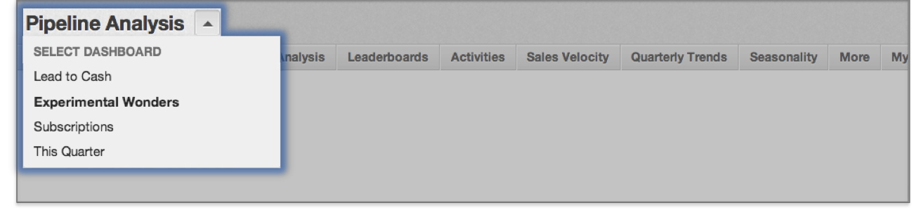
Your new dashboard should now appear in the dashboard dropdown. You can always use this dropdown to switch to another dashboard within the same workspace.
Enter Edit Mode
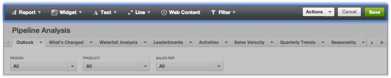
To customize the content and design of your new dashboard, begin by switching into Edit Mode.
Open the gear dropdown, and select Edit.
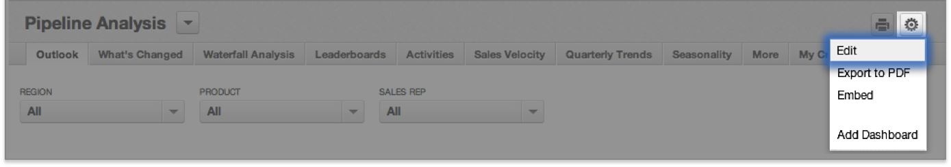
Once in Edit Mode, several changes will take place on your screen. For example, you can use the Actions dropdown to rename, duplicate, or delete the active dashboard.

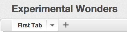
Dashboard tabs also take on a new appearance. You can rename, delete, or copy a dashboard tab to another dashboard within the same workspace by clicking the triangle icon to the right of the tab.
Try renaming your first tab, and then creating several more. Rearrange tabs by dragging them to a new position.
Populate the Dashboard
Entering edit mode also grants you access to the dashboard element menus: Report, Widget, Text, Line, Web Content, and Filter. These all represent categories of dashboard elements that you can add to your dashboard.
Add and Configure a Report
You can add a preexisting report by selecting it in the Report menu. Or, click Create a New Report to navigate to the Report Editor.
Use the Report menu to add a preexisting report to your dashboard. Notice how you can drag the report to reposition it on your dashboard or resize it by clicking it once and then dragging the circular markers that appear on its perimeter.
Configure a report by selecting it while in Edit Mode and clicking the Gear icon that appears. Report configuration panes include:
- Drilling: Define new drill paths that lead users from a linked report metric/attribute value to a related report, which is automatically filtered for the selected value.
- Filters: Choose the filters to apply to the report.
- Arrange: Alter the report’s visibility with regard to other objects on the same dashboard
- Style: Determine the report’s background style: transparent or opaque
Add and Configure a Widget
Widgets are like simple reports that can be defined directly from the dashboard. Key metric widgets display a single metric value that can be filtered for a certain time period. The attribute dimension selected in the by dropdown determines the significance of the date range you’re filtering for. For example, you may filter for data values of leads created or closed during the selected time period.
Use the Widget menu to add a Key metric widget w/ trend to your dashboard. Choose a metric and a time period/dimension you’re interested in. By the Trendline checkbox, determine whether the trendline should display metric values from the past day (D), week (W), month (M), quarter (Q), or year (Y).
In addition to the Arrange and Filters configuration options shared by reports, widget configurations include the Style option where you can customize the number formatting of widget metric values.
Geo Chart Widgets
The GoodData Portal also offers Geo chart widgets – heat maps that allow you to visualize your data broken down by geographic region across an actual map.
For more information on this special type of widget, see Building a Geo Chart.
Add Text Boxes
The Text menu contains the following types of text you can add to your dashboard:
- Headline adds a headline; can contain only one line of text; can be resized horizontally.
- Sub-Headline adds a sub-headline; can contain only one line of text; can be resized horizontally.
- Description adds a text box where you can add multiple lines of text; can be resized horizontally or vertically; can contain a hyperlink (a link to an external webpage) or email address (see further in this sub-section).
- Variable status allows you to check which predefined workspace variables may be affecting how data is displayed for specific users. For example, a filtered variable may be limiting which data values certain users can see in a dashboard’s reports, or a numeric filter may be affecting the way metric values are calculated for certain users.
Add a hyperlink or email address to the dashboard:
Click the Text menu, then click Description. An empty box appears on your dashboard.
Click the link icon:
The dialog for adding a hyperlink opens.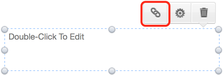
(Optional) Enter the link title. If you do not specify the link title, the URL of the web page or the email address that you enter will serve as the link on your dashboard.
In the Web Address field, enter:
Enter the URL for the web page, in the following format:
https://www.gooddata.com/Enter the email address to show in a mail client after a click, in the following format:
mailto:email.address@domain.com
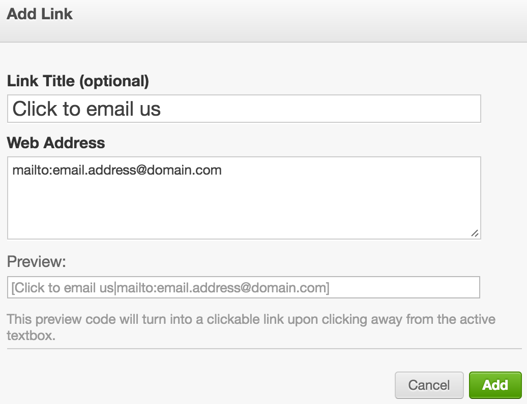
- Click Add. The linked text appears on your dashboard.
Add a Line
The Line menu contains two types of lines you can add to your dashboard: Horizontal and Vertical.
Try adding a horizontal or vertical line. Then reposition and re-size it to divide two sections of your dashboard.
Embed Web Content
The Web Content menu allows you to embed graphics, videos, or entire web pages within your dashboard. To ensure privacy, the URLs of embedded content must be secure. To make the content secure, in most environments, you can simply switch the protocol to “https” in the target web page URL.
Try embedding the GoodData home page in your dashboard by entering https://www.gooddata.com/ into the embedded web content dialog.
Add a Dashboard Filter
From the filter menu, you can add filters that constrain the data used to compute one or more dashboard reports.
Add an attribute filter to your dashboard. Dashboard viewers will be able to use this filter to select attribute values they’d like to include in the dashboard’s report computations. For example, you may choose to show only data associated with the Herbal Essentials, Aquaspirit, and Delightfusion brands.