Theme Properties
Overview
Themes use special JSON structures with CSS properties. This article describes individual properties and gives examples.
Complete JSON structure
This is an example set of the properties that you can customize (expand to display):
{
  "theme": {
    "content": {
      "palette": {
        "primary": {
          "base": "#3049D1"
        },
        "error": {
          "base": "#e54d42"
        },
        "success": {
          "base": "#00c18d"
        },
        "warning": {
          "base": "#f4d521"
        }
      },
      "typography": {
        "font": "url(https://cdn.jsdelivr.net/npm/roboto-font@0.1.0/fonts/Roboto/roboto-regular-webfont.ttf)",
        "fontBold": "url(https://cdn.jsdelivr.net/npm/roboto-font@0.1.0/fonts/Roboto/roboto-bold-webfont.ttf)"
      },
      "button": {
        "borderRadius": "2",
        "dropShadow": true
      },
      "modal": {
        "title": {
          "color": "#6D7680",
          "lineColor": "#DAE2EA"
        },
        "borderColor": "#ffffff",
        "borderRadius": "6",
        "borderWidth": "2",
        "dropShadow": true,
        "outsideBackgroundColor": "#DAE2EA"
      },
      "tooltip": {
        "color": "#C8D0FF",
        "backgroundColor": "#07124E"
      },
      "analyticalDesigner": {
        "title": {
          "color": "#6D7680"
        }
      },
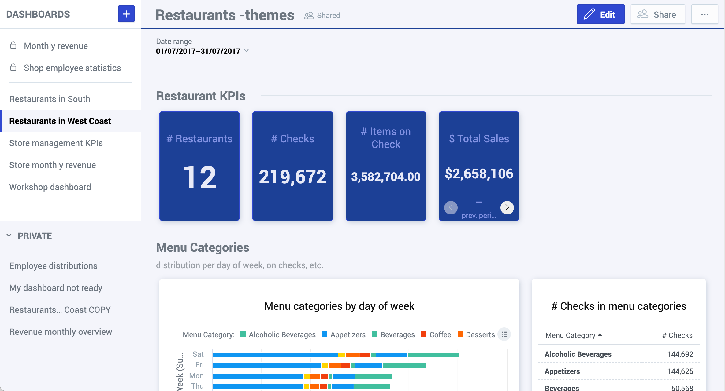
      "dashboards": {
        "title": {
          "color": "#6D7680",
          "backgroundColor": "#F4F5FB",
          "borderColor": "#1b4096"
        },
        "navigation": {
          "title": {
            "color": "#6d7680"
          },
          "borderColor": "#DAE2EA",
          "item": {
            "color": "#6d7680",
            "hoverColor": "#000",
            "selectedColor": "#000",
            "selectedBackgroundColor": "#F4F5FB"
          },
          "backgroundColor": "#ffffff"
        },
        "filterBar": {
          "filterButton": {
            "backgroundColor": "#F4F5FB"
          },
          "backgroundColor": "#F4F5FB",
          "borderColor": "#1b4096"
        },
        "section": {
          "title": {
            "color": "#6D7680",
            "lineColor": "#dde4eb"
          },
          "description": {
            "color": "#999EA5"
          }
        },
        "content": {
          "kpiWidget": {
            "title": {
              "color": "#8292E3",
              "textAlign": "center"
            },
            "kpi": {
              "primaryMeasureColor": "#E8EAF7",
              "secondaryInfoColor": "#8292E3"
            },
            "borderColor": "#3049D1",
            "borderRadius": "6",
            "borderWidth": "1",
            "backgroundColor": "#1b4096",
            "dropShadow": true
          },
          "widget": {
            "title": {
              "color": "#101010",
              "textAlign": "center"
            },
            "borderColor": "#ffffff",
            "borderRadius": "6",
            "borderWidth": "2",
            "dropShadow": true,
            "backgroundColor": "#ffffff"
          },
          "backgroundColor": "#F4F5FB"
        }
      }
    },
    "meta": {
      "category": "theme",
      "deprecated": "0",
      "isProduction": 1,
      "summary": "",
      "tags": "",
      "title": "Demo theme"
    }
  }
}
General rules
To customize KPI Dashboards, update the properties in the dashboards section.
To customize Analytical Designer, update the properties in the analyticalDesigner section.
When creating your themes, follow these general rules:
| Colors | Use the following color coding formats:
Background colors should give enough contrast for texts to be readable. |
| Borders | Border radius and weight use pixels. To use a different unit, include it in the string. Example: |
| Widget borders | The recommended maximum for the widget border radius is 30px. The recommended maximum width of widget borders is 4px. To hide the border of widgets, use a transparent color instead of borderwidth=0. Example: |
| Meta section | Regardless of the number of changed properties, every custom theme must include the |
Properties
The following sections contain information about individual properties, examples, and exemplary codes.
Colors
The basic colors for your KPI Dashboards and Analytical Designer are defined in the palette section.
Apart from these colors, you can also change colors for individual visual element types. See the sections below.
| Property | Description | Example code |
|---|---|---|
| Primary color | Color for primary buttons, links, and accented visual elements. Default: | Custom: 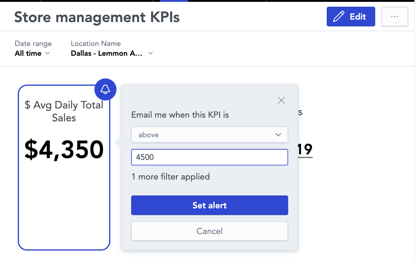 |
| Error color | Color for error messages and error states. Default: | Custom: |
| Success color | Color for success messages and success states. Default: | Custom: |
| Warning color | Color for warning messages and warning states. Default: | Custom:
|
| Complementary | For KPI Dashboards only. Colors for various visual elements, such as borders, lines, shadows, buttons, and so on. The complementary palette consists of 10 colors of your choice (
The individual colors are used for:
For examples of complementary palette usage, see Theme Examples.
| |
Fonts
Fonts are defined in the typography section of the JSON.
Specify both variants of the font (regular and bold). Both variants must be from the same font family.
Use the following formats to external fonts:
- Absolute URL -
"font": "url(https://somewebsite.com/path/to/font.woff)" - Explicit format -
"font": "url(https://somewebsite.com/path/to/font.woff) format('woff')"
Use the following formats to local fonts:
"font": "local(Arial)""font": "local(Time New Roman)""font": "local('Times New Roman')"
| Property | Description | Example code |
|---|---|---|
| Regular font | Specify a regular font. | |
| Bold font | Specify a bold face of the font. | |
Recommended fonts
Here are some recommended free fonts that you can use in your themes.
| Sans Serif Fonts | Serif Fonts |
|---|---|
Visual elements
Customize visual elements, such as buttons, overlay windows, and tooltips.
| Property | Description | Example code |
|---|---|---|
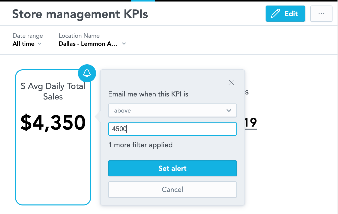
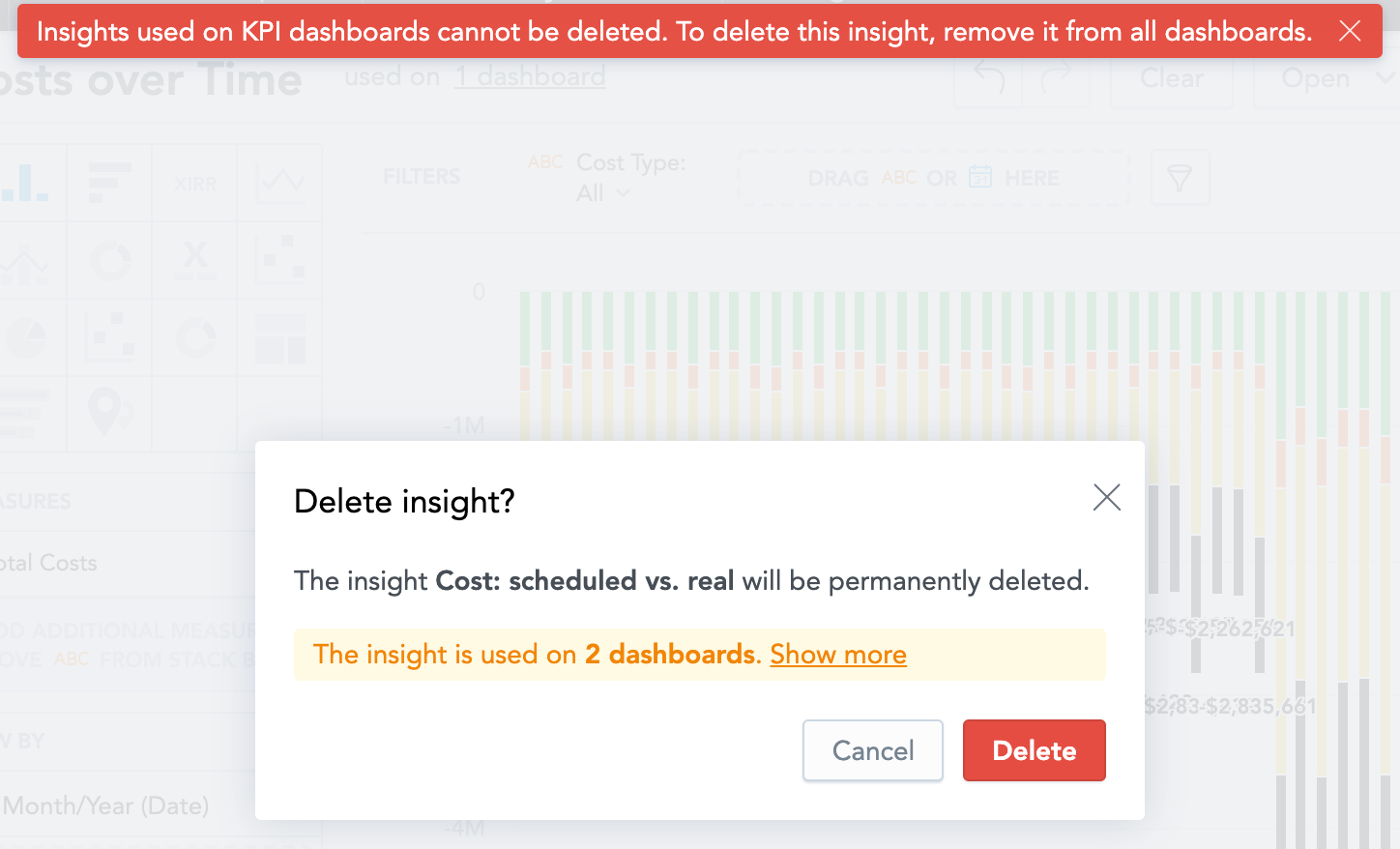
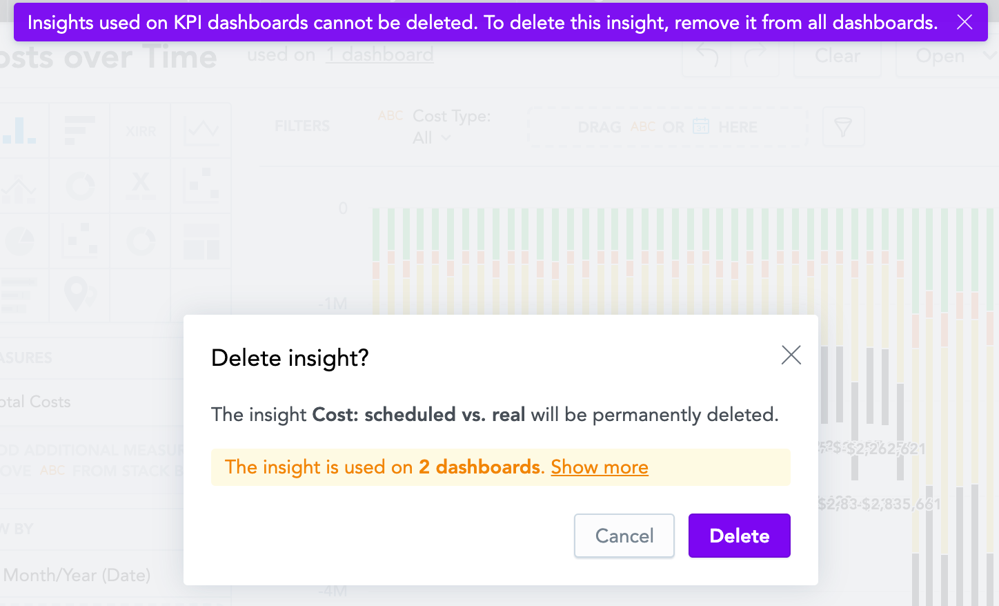
| Button | Customize the look of buttons in KPI Dashboards and analytical Designer. Default: | Custom:
|
| Overlay windows | Customization of overlay windows. | |
| Tooltips | Customize tooltips. Default: | Custom:
|
Analytical Designer
Customize the color of the insight names.
| Property | Description | Example code |
|---|---|---|
| Insight title color | Color of the insight name. Default:
| Custom:
|
KPI Dashboards
Customize various elements in KPI Dashboards, such as titles, filters, navigation, and widgets.
| Property | Description | Example code |
|---|---|---|
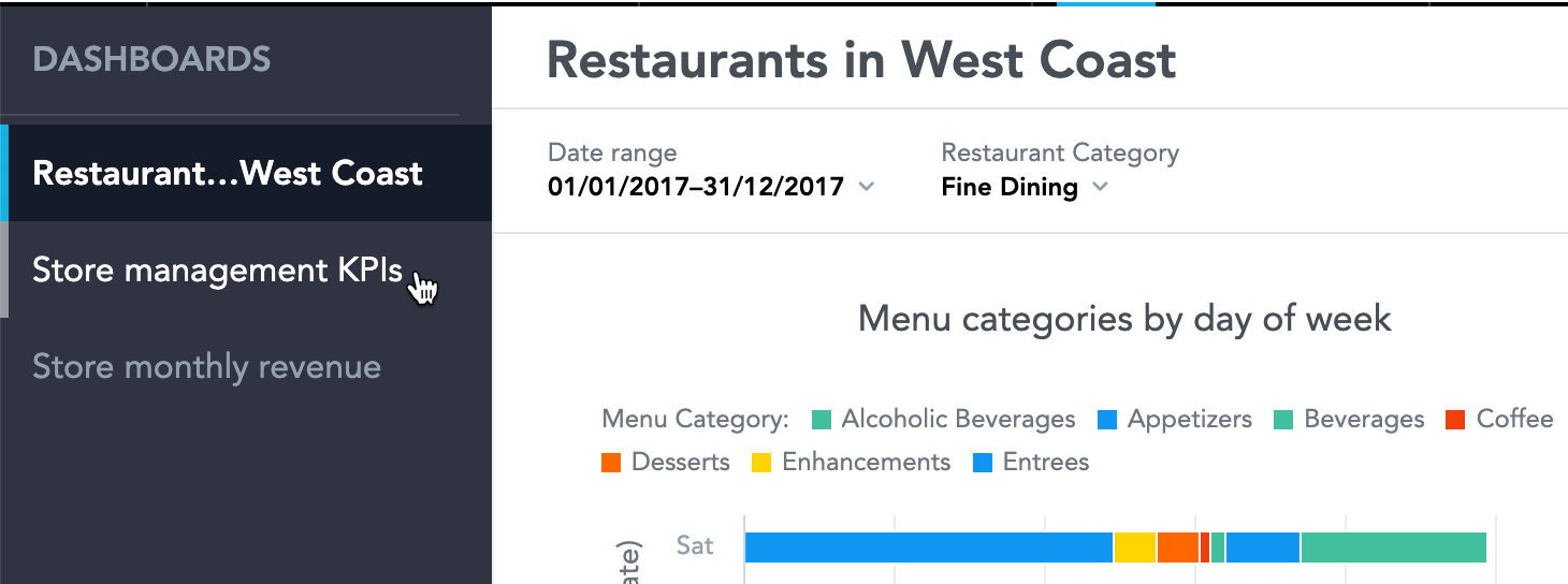
| KPI Dashboard title | Customize the title of your KPI Dashboards. Default: | Custom: |
| Navigation | Customize the left navigation of the KPI Dashboards. Default: | Custom:
|
| Filter bar | Customize the look of the filter bar of your KPI Dashboards. Default: | Custom: |
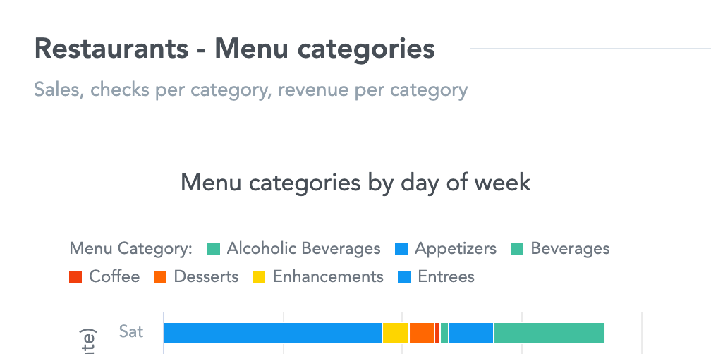
| Dashboard sections | Customize the title and description of the sections on your KPI dashboards. Default: | Custom: |
Content section
| Property | Description | Example code |
|---|---|---|
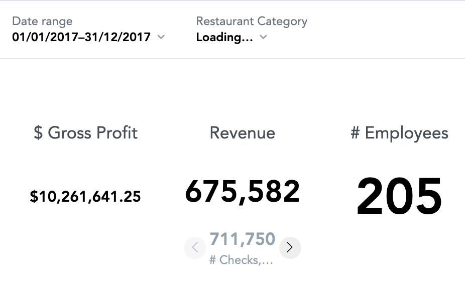
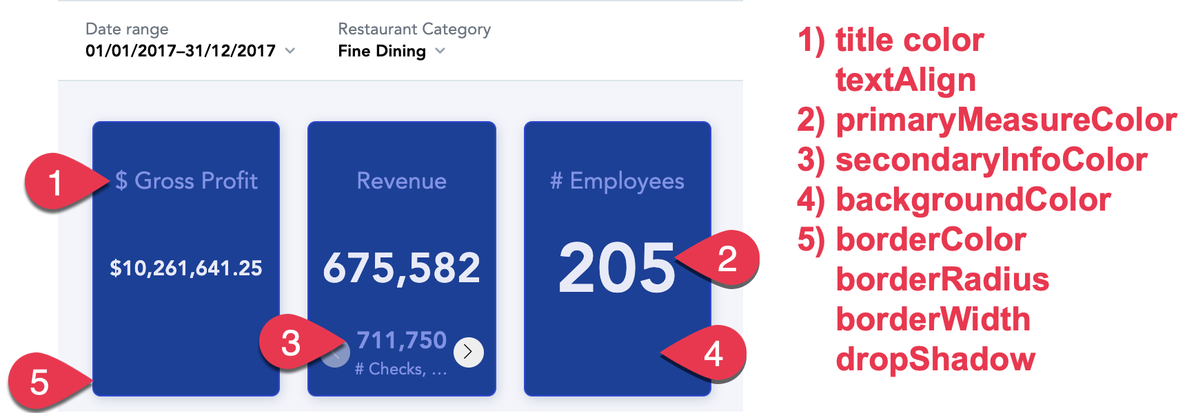
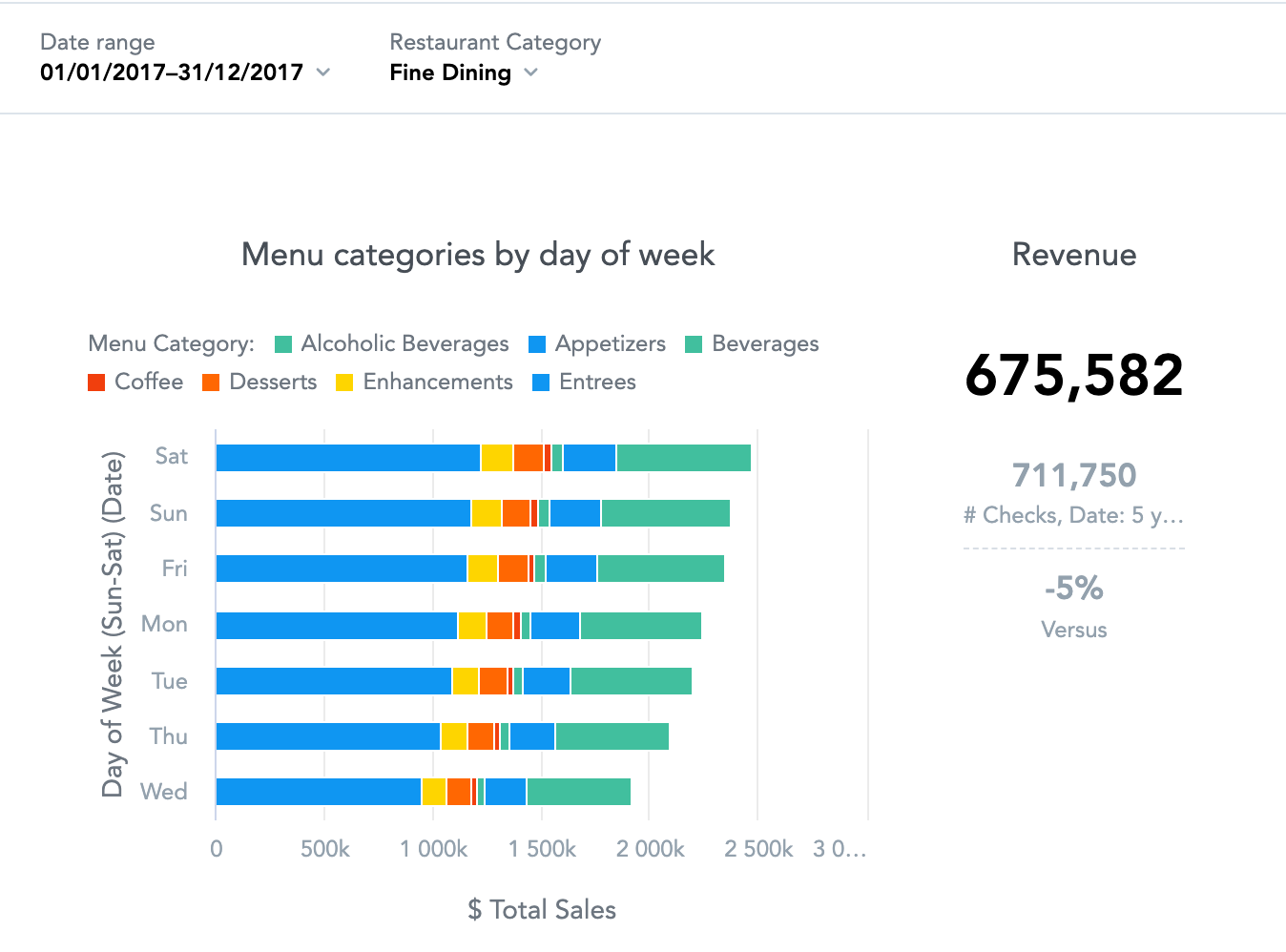
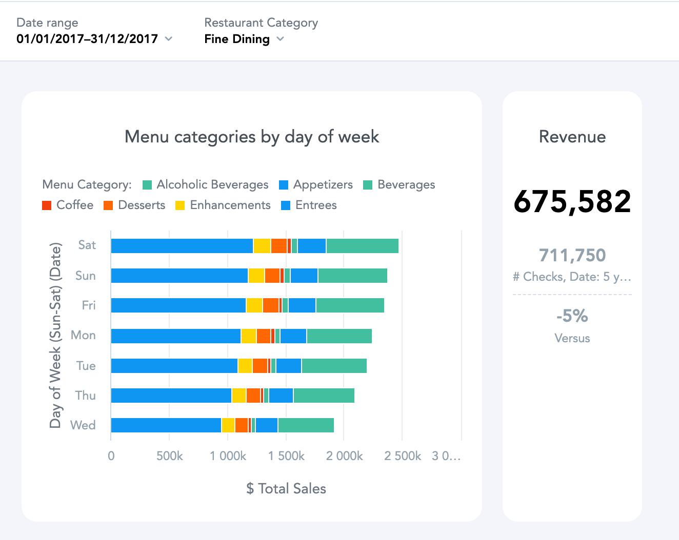
| KPIs | Customize the look of KPIs on KPI Dashboards. Keep the border radius at 4px or below to prevent display problems in exported PDF files. Default:
| Custom: |
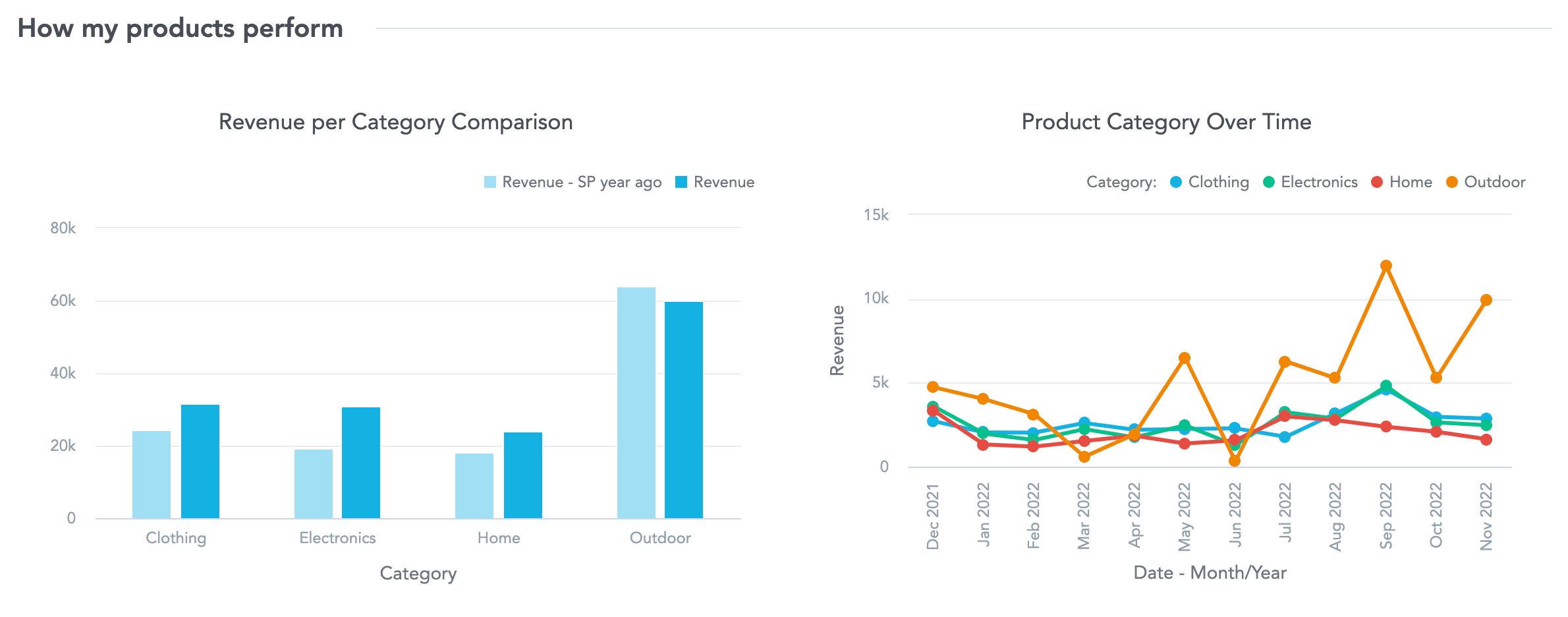
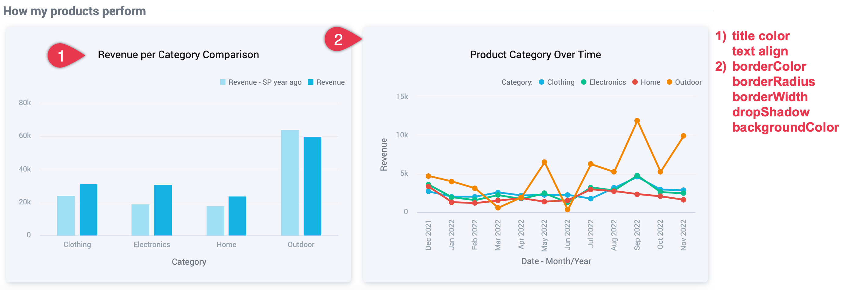
| Insights on KPI Dashboards | Customize the insights added to KPI dashboards. If you have headline insights on your KPI dashboard, keep the border radius at 4px or below to prevent display problems in exported PDF files. Default: | Custom: |
| Background color | Color of the KPI dashboard background. Default: | Custom: |
