Pivot Tables
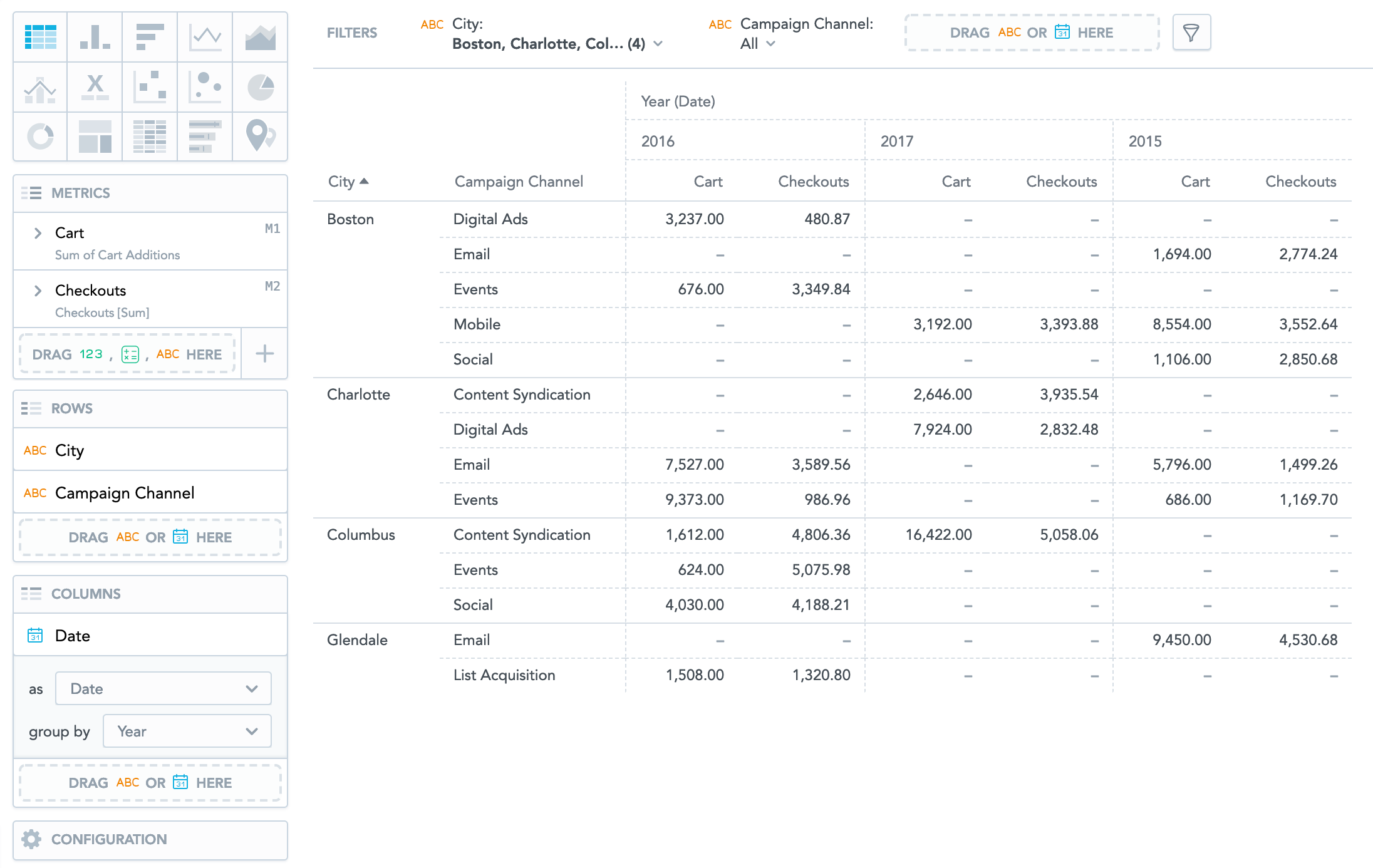
Pivot tables in Analytical Designer can have up to 20 attribute rows and 20 attribute columns to refine data in your insight. The data is then merged according to the attribute order in the Rows/Columns sections. Rows or columns with aggregated data can be generated for tables of up to 1,000 values.
Tables are generated depending on whether you add attributes to the Rows or Columns section. If you only add them to Rows, the resulting table is oriented vertically. If you only add them to Columns, it is oriented horizontally.
Pivot tables have the following sections: Metrics, Rows, Columns, and Configuration.
Pivot tables can also:
Display the values as a percentage.
Compare your data to the previous period or same period of the previous year. For details, see Time over Time Comparison.
Group data when sorted by the first item in the Rows section.
For information about common characteristics and settings of all insights, see Insight Types.
If you create a pivot table, you cannot open the insight as a report. The Open as Report option is disabled.
Column width
Tables automatically adjust the width of all the columns according to the cell content. The size is calculated according to the content in the header of the column that represents the lowest level of the grouped attributes.
To disable the automatic resizing, set the enableTableColumnsAutoResizing platform setting to false. For details, see Configure Various Features via Platform Settings.
You can also resize each column manually by dragging the edge of the column in a header.
- To resize all columns in your insight at once, hold the Windows/Command button while dragging.
- To resize all columns of one metric at once, hold the Alt/Option button while dragging.
- Double-click the edge of the column to resize to the default size of the column.
On KPI Dashboards, small tables are automatically resized to fit the whole width of the widget. For details, see Resize widgets in Edit Items on KPI Dashboards.
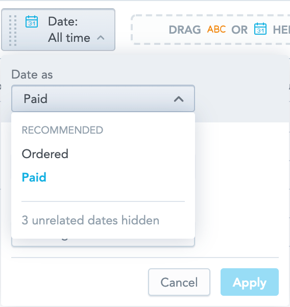
Multiple date attributes
To add multiple date attributes to pivot tables, you must have the enableNewADFilterBar platform setting set to true. For details, see Configure Various Features via Platform Settings.
Pivot tables support multiple date attributes. For each date attribute, you can select a different date dimension to analyze your data with various date contexts.
For example, you can display when individual customers ordered your products and when the invoices were paid.

When you filter the whole insight by date, you can select any dimension that is available.
When comparing your data over time, the date filter must have the same dimension as one of the date attributes in your insight. For additional information about comparing your data, see Time over Time Comparison.
Aggregate data
You can generate a row or column with aggregated metrics data (specified by individual attributes) using the following functions:
Sum
Max
Min
Avg
Median
Rollup (Total) For information about the rollup function, see Aggregate Table Data.
To aggregate data, the table must include at least one item in the Metrics section and one item in the Rows section.
Steps:
Create a pivot table in Analytical Designer. For details, see Create Insights.
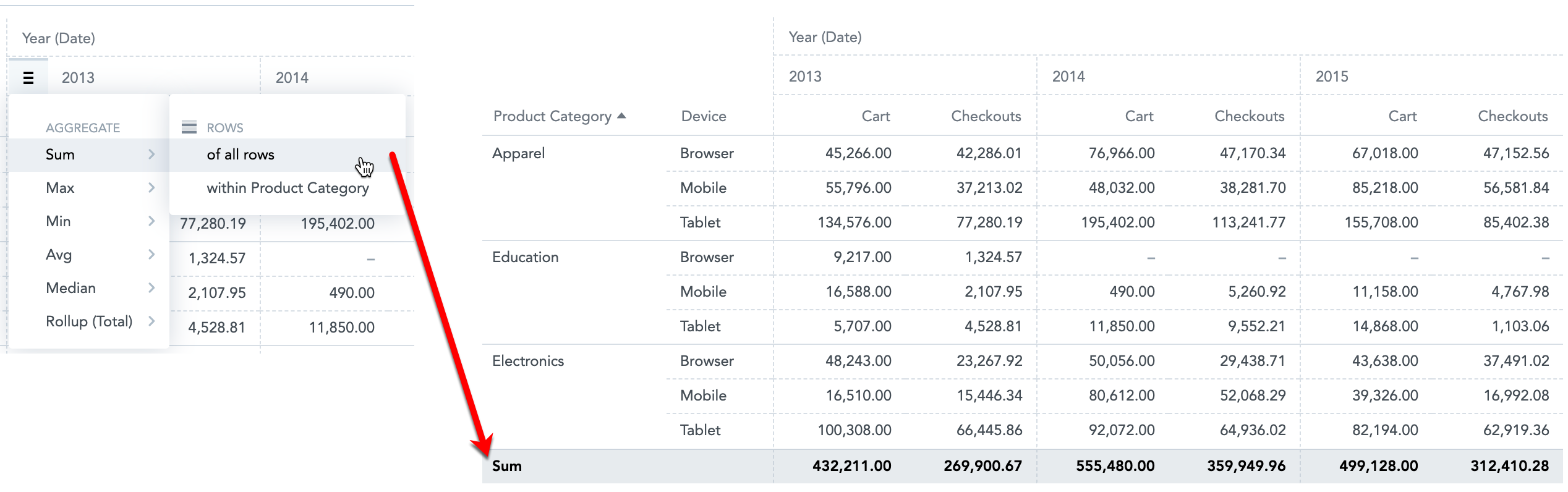
Hover the mouse over a column header. A burger icon displays on the left side of the header.
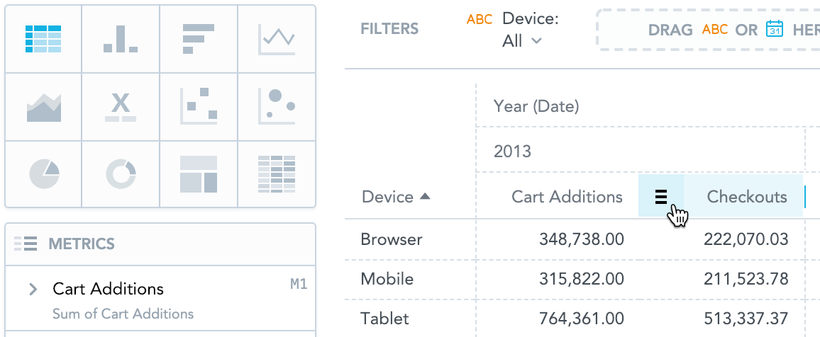
Click the burger icon and select a function from the menu. Depending on the selected function, a new row or column with the function name and appropriate values is displayed.

You can add functions for all columns or for individual attributes or metrics. Hover your mouse over column headers to display the burger icon. The following image shows the
Sumfunction added in the Year attribute and theAvgfunction added in the Checkouts metric.
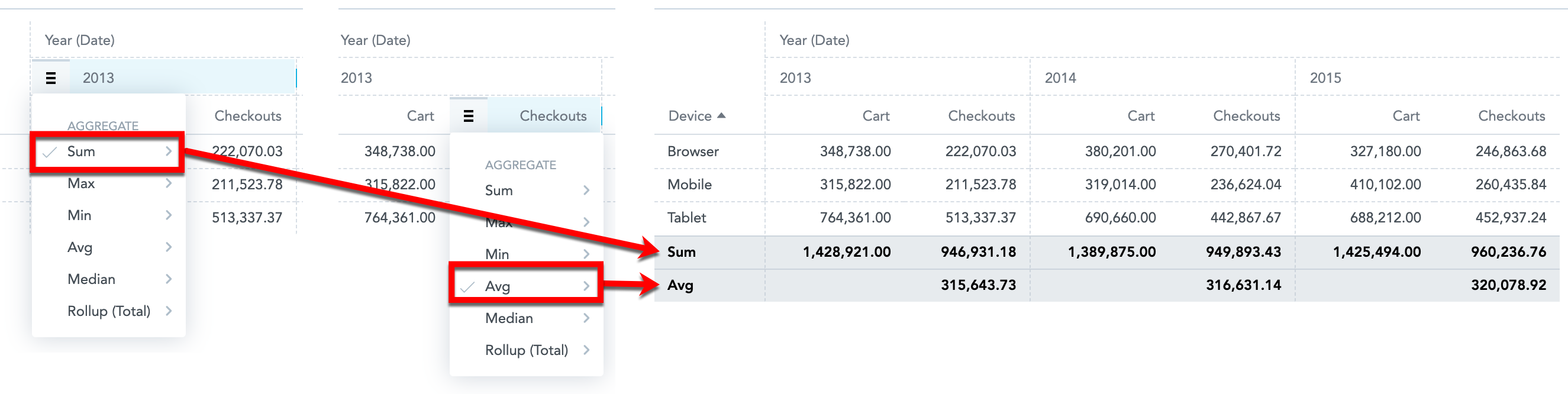
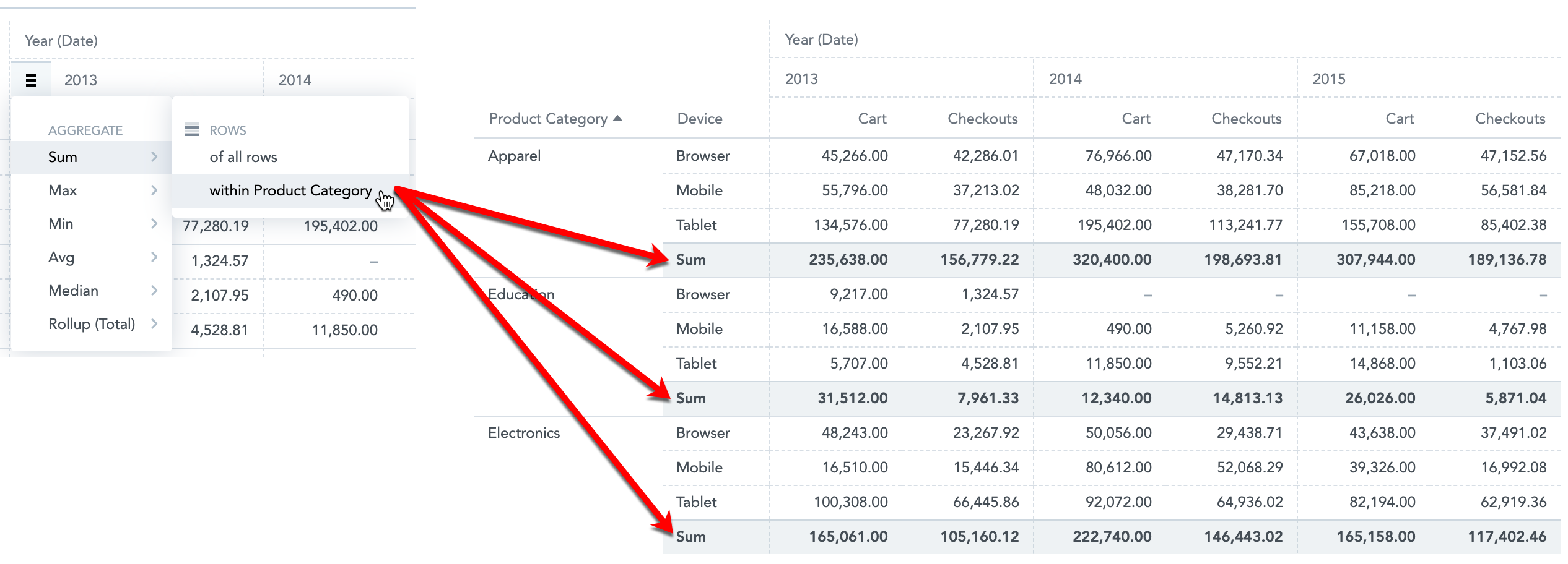
- If you have multiple items in the Rows section, you can apply the function to all rows (grand total) or to individual attributes from the Rows section (subtotals). The same applies to Columns in horizontally oriented tables.
- To delete a function, click the burger icon and click an already-selected function (with a tick sign) to hide the function row.
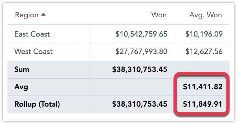
Rollup (Total)
Rollup totals are “smart” aggregations.
They are useful for tables that display metrics representing average values, for example, to avoid aggregations like averages of averages.
See the following examples:
- For the Won metric, the rollup represents the sum of all regions' won amounts. Sum and Rollup (Total) are equal.
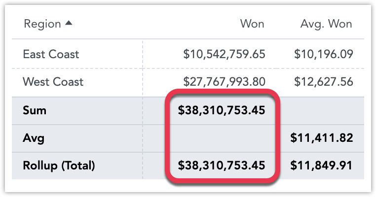
- For the Avg. Won metric, rather than take the average of the row’s values (which are already averages), the rollup averages the original underlying data—before it was aggregated by the Won metric and broken into the East Coast and West Coast regions by the Region attribute. The value of the Avg (an average of averages) differs from the Rollup (Total) average (an average based on the original data).
For information about tables in the Reports section, see Working with Tables.