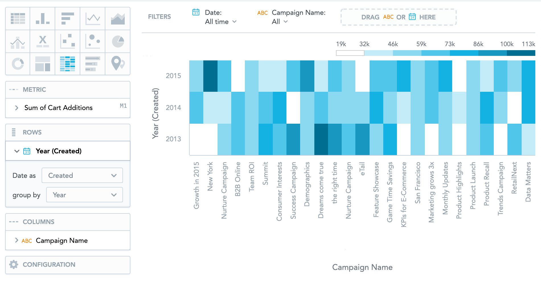
Heatmaps
Heatmaps display data as a matrix where individual values are represented as colors. You can use heatmaps to discover trends and understand complex datasets.
Heatmaps have the following sections: Metric, Rows, Columns, and Configuration .
The legend above the heatmap shows the values of individual colors. The higher the value, the darker the color.
Clicking a value in the legend does not hide it from the insight.
For information about common characteristics and settings of all insights, see Insight Types.
Multiple date attributes
To add multiple date attributes to pivot tables, you must have the enableNewADFilterBar platform setting set to true. For details, see Configure Various Features via Platform Settings.
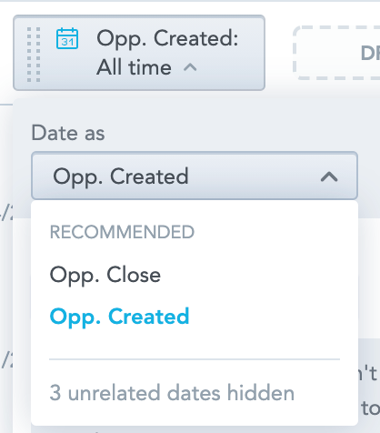
When you add a date attribute to Rows and another to Columns, you can select a different date dimension for each date attribute.
To select different date dimensions for the date attributes, you must have the enableNewADFilterBar platform setting set to true. For details, see Configure Various Features via Platform Settings.
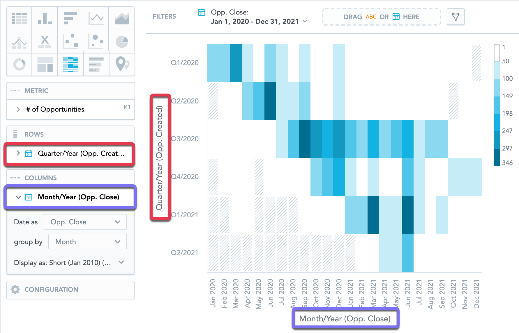
Also, when you filter the whole insight by date, you can select any dimension available.
For information about heatmaps in the Reports section, see Create a Heat Map Table.