Column Charts
By default, when you add metrics or attributes to an insight, they are displayed in a column chart.
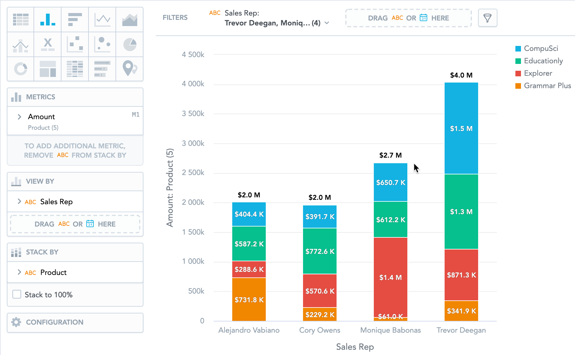
Column charts have the following sections: Metrics, View by, Stack by, and Configuration.
In column charts, you can also:
Display the values as a percentage. You must add Dates or Attributes to the View by section.
Stack the chart by attributes. To add an attributes or date to the Stack by section, you must have only a single item in the Metrics section. If you have multiple items in the Metrics section, you can stack them. For details, see Stack Metrics.
Compare your data to previous period or same period of the previous year. For details, see Time over Time Comparison.
Slice your data by up to two dates or attributes. Add the dates or attributes to the View by section.
If you add two dates in the View by section, they must have the same date dimension (the Date as option) - if you change the date dimension of one date attribute, Analytical Designer changes the date dimension of the second date attribute automatically. The Group by option can have different values.
Display a secondary y-axis on the right side. You must select the show on right axis checkbox in metric settings.
For information about common characteristics and settings of all insights, see Insight Types.
In column charts, the data is sorted by the values in the View by section.
In bar charts, the data is sorted by the values of the first item in the Metrics section.